T: The next Modern Masters is still a few weeks away from being fully spoiled, so this week Two Jesses are bringing you something different: A retrospective about the male gaze in Magic. Excited? Curious? Uncomfortable? Read on to learn which emotion is the correct one!
In the Beginning There Was Earthbind
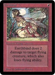
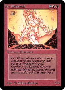
K: From the beginning Magic has had its issues with depictions of women. Earthbind might be the card that comes first to most people’s minds when they think of weirdly sexualized Magic art, but actually looking through the Alpha art, it’s not all that bad as a whole. I mean, there is this card, which is utterly inexcusable, but other than that the only other art that leaps out as objectifying is Fire Elemental.
T: If you’re a rational man, of course you would react logically, skeptically, and impartially to any claims made about your beloved fantasy card game that you formed a deep emotional bond with during an intense period of adolescent alienation wherein it supplanted the human affection you so desperately craved at the time. Sexism? In Magic? Surely we must be mistaken. You’d be entitled, and maybe even correct to react with violent defensiveness and indignant outrage. But don’t do that stuff! You can’t just get all emotional. You can’t let your subjective “feelings” cloud your completely fair and unbiased judgment of your super cool game that you freaking effing love and would honestly defend to the death if necessary. You’ve got to be objective. You’re a rational guy, and you’re super smart, and good-looking, and rich. I promise, that if you just keep an open mind, by the end of this article you too will see that what always seemed like a series of isolated incidents is in fact a series of connected incidents, as is any series of incidents, due to the continuity of spacetime. Fact!
K: It helps that the set contains a lot of images of female characters looking as powerful and competent as their male counterparts. I’m fond of Benalish Hero and Circle of Protection: Blue in particular. The first set also contains a similar amount of beef-cakey depictions of males—Unholy Strength and Veteran Bodyguard, for example. The first few sets maintain this delicate balance of being somewhat objectionable, but nothing that would, say, drive away a potential female player. Still, there is Earthbind. At least it can’t get much worse than that… right?
T: While Earthbind and Fire Elemental may seem at first like random markings on pieces of cardboard, upon closer inspection, they are actually sexualized depictions of the female form. “But Jesses,” you might say, “Huge boobs made of fire are just a natural part of Fire Elemental anatomy. It’s nature! And what’s wrong with Earthbind? Are we not allowed to have needlessly eroticized images of tied-up women in our fantasy games all of a sudden?” Well, of course you are! You’re a big brave man, and you can beat up anybody who tries to take your erotic fantasy art away from you. But is it possible that a fantasy game could still be called a fantasy game without having fire boobs or naked tied-up women at all? You might be surprised to know that some very well-educated public figures believe that the answer could, in fact, be yes.
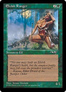
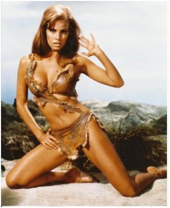
T: Let’s take a look at Elvish Ranger, for instance. Then, let’s take a look at a publicity photo of contemporary sex symbol Raquel Welch from the 1966 British historical drama One Million Years B.C. (see below). While not identical, it’s clear that certain parts of each image were chosen to cater to a particular point of view. In this case, it’s that of someone who’s really into doeskin bras. Is there any other way to depict a determined ranger pushing herself to her athletic limits than through the glistening sweat on her heaving bosoms? Answering this question is left as an exercise for the reader.
K: Now that we’ve established a working definition of male gaze, let’s take a look at some memorable examples. Please note, multiple cards with illustrations like these were in every set, and this is a sampling that only scratches the surface. But that’s kind of the point, if it only happened a little bit, it wouldn’t be quite as big of a problem. Instead, it’s interwoven into pretty much all of Magic’s history.
Trope #1: Naked for No Reason
T: Nothing says “sylvan paradise” like a nude portrait of Randy Asplund-Faith’s 6th grade science teacher on the banks of a landscape fit for a dentist’s waiting room. If the pointless nudity doesn’t put off female players, the uncomfortable thought of sitting bare-assed on gravel definitely will.
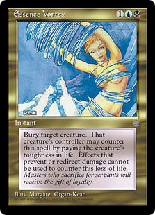
K: Okay, I know I’m getting kind of sidetracked here, but I just want to talk about what a weird card Essence Vortex is apart from it’s bizarre and inexplicable art. Was it really worth it to make such a wordy, complicated card for this narrow of an effect? Why is it so much worse than Dark Banishing, which is in the same set, at a lower rarity? As for the art, I can only assume that when you get caught in an essence vortex, the clothes are the first thing to go.
Trope #2: Upskirts
T: I hate to disappoint you, but when women talk about a ‘glass ceiling’ this isn’t what they mean.
K: Male gaze doesn’t just have to be about nearly naked ladies, sometimes it can be as simple as the actual perspective. Is there a compelling reason that we’re looking at things from this angle, besides the inclusion of a butt?
T: I wish the artist would have put as much effort into properly using foreshortening as he did into highlighting the creases of those elven glutes. It looks like Eladamri’s doing the limbo.
K: “Ach! Hans, run! It’s a sexual predator!”
T: Too real. You know, I always wondered what the hell a “Lhurgoyf” was supposed to be. Don’t be a ‘goyf, guys. When people flee from you in terror, respect their boundaries.
Trope #3: “Strong Female Characters”
K: Hopefully, the point is made that Magic has a problem with sexually objectifying women, but objectification is not all we’re talking about here. When you begin to objectify your legends and your planeswalkers, the characters your audience cares about and identifies with, things start to get really scary. What this ends up doing is delivering a negative message to women about their worth being tied to their appearance. I’m gonna remind people again that this card game is supposed to be friendly for people ages 13 and up, of all genders. What messages do these cards send?
T: In case you’re wondering how we became experts on female empowerment, both of us are college-educated middle-class males, and therefore experts on everything. Also, it’s incredibly easy for anyone to learn to recognize and point out sexism because it’s everywhere.
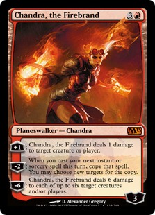
T: Now when your friends ask if you know any “hot chicks” who play Magic, you can have a clever response ready, which is telling them that they’re the reason more women don’t want to play this game in the first place. If she has all that plate mail, why are her thighs completely exposed to attack? Is she buying her armor on layaway?
K: I think it’s just that no one makes lower-body armor in Chandra’s size. I mean, what are you supposed to do when your each of your thighs are larger than your waist?
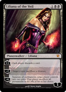
T: Liliana Vess is described on the Wizards of the Coast website as “a temptress whose beauty belies a dark secret and even darker associations”. I’m sure it’s only a coincidence that out of the literally infinite possibilities for her character’s design, they just happened to pick one that lines up with stereotypes about evil women exploiting their sexuality for personal gain. Just like it’s a coincidence that her enchanted diadem possesses only enough anti-gravity magic to make her underbust corset work, but not to keep her shoulder straps from falling off all the time.
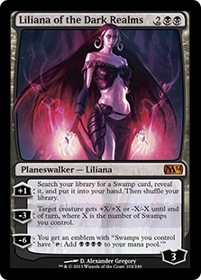
K: I like that her ultimate is basically an MRA’s nightmare vision of divorce.
K: Unlike Chandra, who has at least maintained the same ridiculous outfit over time, Liliana seems to be getting progressively more objectified and less dressed as more version of her are printed. This also seems like a fine place to point out that only 17 of the 57 planeswalkers that have been printed so far have been women. 30 percent may not be the worst number, but it’s certainly significant, especially when you consider that planeswalkers are supposed to be the player stand-in. There are other ways that planeswalkers pretty poorly represent the player base (age, ethnicity, etc), but that’s a conversation for another time.
T: You can’t argue with numbers. I’ve tried. If I didn’t know better, I’d say there were factors other than impartial random chance and math going into the representation of human beings in Magic.
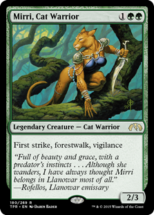
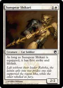
T: Mirri is one of the earliest examples of the phenomenon where they’ll put an animal head on a female human body that’s basically dressed in fancy lingerie. I’m not sure what effect this is supposed to have on the viewer other than subtly inculcating us to ignore anything that happens above a woman’s shoulders.
K: Oh believe me, reader, we’re gonna get into that.
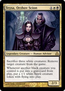
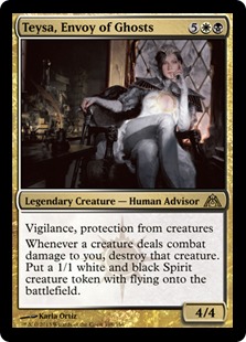
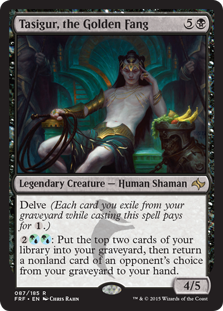
T: The first time I saw Teysa, I thought she was an unusually sexualized waifish dude. It made me take a step back and think a little bit about how ridiculous his outfit was, even though women were dressed like that all the time. Wizards made sure to clear up that misunderstanding in Return to Ravnica with some Basic Instinct leg action. See Tasigur, the Golden Fang (below) for a recent example of what it looks like when they actually do this with a male character for a change.
K: I love the original Teysa art, mostly because it is a fairly good recreation of the experience of most female Magic players who venture out to FNM — being frustratingly leered at by creepy dudes.
T: Actually, that sounds like what happens to women everywhere. Not like that makes it better.
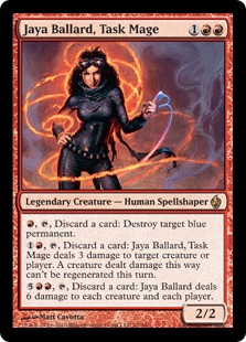
K: “Of course you should fight objectification with objectification. You should fight everything with objectification.” -Jaya Ballard, Sex Thing
T: All that heat must be slowly shrink-wrapping her in her own clothing, kind of like the dryer does with your laundry. I wonder if she can even change out of it anymore. I’ll tell you what, if I spent all my time around raging infernos, I’d want to wear something a lot more breathable than a leather catsuit.
Trope #4: The Bikini Chainmail Gaze
K: “Hey, quit bothering me, Two Jesses. Are you saying attractive women aren’t allowed to be on Magic cards? Maybe it is you who is the real sexist here!” No, imaginary strawman, that’s not the point I’m making at all. It’s just the way these characters are depicted in outfits and poses that don’t really make sense at all flavorfully and only conceivably serve to display them as sex objects. Try to imagine charging into combat with a bare midriff and no pants on, and you might start to see how silly and transparent this stuff all is.
T: My imaginary strawman already stopped reading a while ago and went to post angry comments, so I made an imaginary meteor crash into his house.
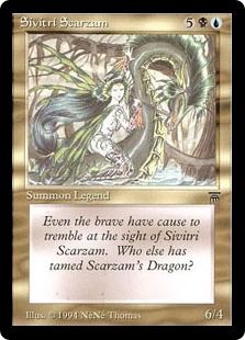
T: What did Freud say? Sometimes a dragon is just a dragon?
K: “Taming Scarzam’s Dragon” might be my new favorite euphemism. We could do an entire article on the ridiculous amount of phallic symbols that this game has in it.
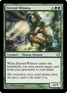
K: I can’t think of anything better to represent eternity than a scantily-clad 16 year old girl squatting down, can you?
T: Hey, now that you mention it, that mini-skirt made of thorns doesn’t look super comfortable.
K: I guess it’s not enough to bring back any card from the graveyard these days, you’ve gotta do it with a little sex appeal. That’s what I love about Eternal Witnesses. I keep getting older and they just stay the same age.
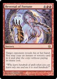
T: There was a lot of this in Mirrodin. I guess being in the all-metal world meant it was open season on uncomfortable clothing.
K: Don’t forget that on Mirrodin, a lot of the ‘armor’ is actually just metal skin. This particular look appeared on enough cards that ‘boobs half made out of metal’ must’ve been in the style guide. I don’t even want to guess at what all that means psychologically.
T: So you’re saying they actually had a free pass to obliquely depict nudity? In that case, I’m surprised we didn’t see any anatomically-correct metal nipples.
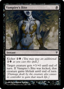
K: For a card called ‘vampire’s bite’ they sure are zoomed out pretty far from the actual bite-y part. It’s almost as if they wanted something else to be the focal point of the card…
T: I feel like they could have asked this artist to illustrate a vampire doing absolutely anything and he would have given them the exact same picture. A fierce vampire warrior charging into battle? Here’s a disembodied torso! A stealthy vampire rogue stalking her prey? Torso! A wealthy vampire noblewoman surveying her estate? Let’s get some solid gold pasties on that torso!
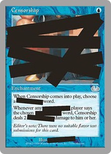
T: This one was so over-the-top that even Wizards realized it, and turned it into a parody card in Unglued. I guess an ambiguous self-deprecating joke is almost the same thing as taking accountability.
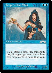
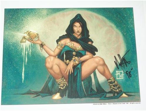
K: My favorite element of this art is that it’s for a card called Keeper of the Mind. Yeah, this is the wizard that is supposed to be most associated with intellect. Matthew Wilson, if this woman was telling you the secrets of the multiverse, would you even be listening?
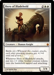
K: I have to imagine that the 4 toughness is come from that rockin’ metal horse, because it’s certainly not coming from Hero of Bladehold’s “armor”. The worst thing about this card is that it was a pre-release promo. You know, the thing you get for going to what is supposed to be the most casual-friendly starting point for competitive Magic. Even more mindblowingly, the other promo you could choose for this one was another objectified woman in Glissa, the Traitor. You can have this one or you can have this one. Which do you choose, prospective female Magic player at her first tournament?
T: Speaking of Glissa, check out those gloves. It looks like she’s wearing formal wear and swimwear at the same time.
Trope #5: Angels in the Centerfold
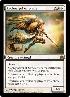
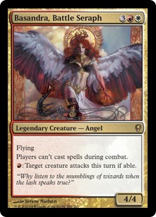
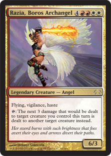
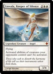
K: And sometimes the male gaze just gets weird. I can’t think of a more obvious example of this than in the sexualization of Magic’s angels. You don’t have to be a religious person to find this a little unsettling. It’s just bad flavor.
T: I have a theory that Magic’s angels are all female because homophobic fantasy artists hear them described as ‘beautiful’ and then get grossed out by the idea of drawing a guy.
K: Don’t you hate it when you charge into battle and then realize you forgot your pants? Talk about embarrassing!
K: Whip me battle seraph, I’ve been a bad wizard! This is a piece of Magic art that reflects poorly enough on the game that you probably want to make sure that other adults don’t see it. I’m also noticing a pattern where the more obscure the supplemental product is, the more comfortable they are cranking the sex up to 11.
T: I was so focused on Razia’s stainless steel hot-pants that I almost didn’t realize she’s about to slice her own wing off.
T: They just wrapped her up in bedsheets, right? This looks like a mattress ad.
Trope #6: Depressive Vampire Nightmare Girls
K: What could be weirder than a sexy angel? Friend, Magic’s just getting warmed up.
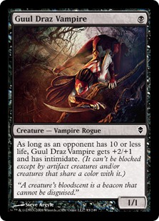
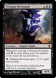
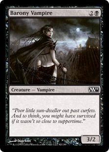
T: Around the design of Zendikar Block, Twilight and True Blood were popular enough that Wizards opted to bring Magic‘s vampires front and center. It was also apparently popular at the time to have the cat-like flexibility of a teenage gymnast.
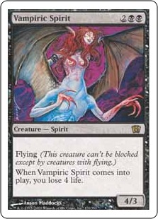
T: While the “vampire ghosts don’t wear clothes” argument does hold water, I’d respond with the “vampire ghosts aren’t real, so they look however the artist decides they should look” argument.
T: “Hey, sun-dweller! My pupilless eyes that can sense the body heat of the living are up here.”
K: Yeah, I think Innistrad Block was actually the worst of it. You could make an argument that the overt sexualization happening on so many of these cards kind of fits with the horror movie tropes theme, but somehow I just don’t think that much thought went into it. Like most examples of privilege, it needs only the barest of excuses to manifest itself.
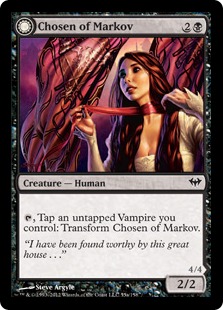
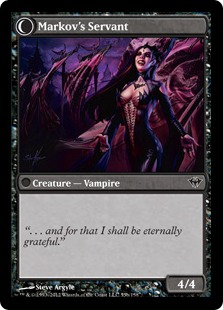
T: Honestly, I think Innistrad is probably the reason we got this blowback of surprisingly progressive design in Theros. Someone at the company must have flipped up a Markov’s Servant (below) in the middle of a game with his daughter and been like “Oh, so that’s this ‘objectification’ thing that feminists are always so upset about.”
Trope #7: Monsters (With Boobs!)
T: Am I supposed to be scared? Aroused? Who cares! No matter what dark part of the human psyche it arose from, this has got to be one of the worst things in fantasy art.
K: Hey, at least she’s a size 0, like every other art we’ve seen today. Who would want to look at a fat hideous vampire abomination? That’d just be gross!
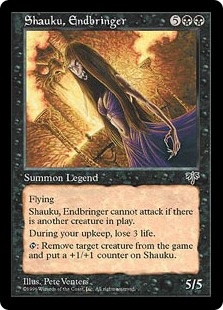
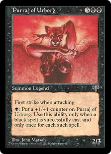
T: Cat women with huge human breasts almost deserve their own little sub-section. Purraj and Mirri were bad, but in Mirrodin it got even worse.
K: Take a still from Madonna’s “Vogue” music video, remove her head, and replace it with a puma’s? No, that’s not something a serial killer did, it’s something that was done on purpose for a card game that is ‘appropriate for ages 13+’.
T: This card raises several moral and practical questions about cats with breast implants, and I refuse to ask any of them.
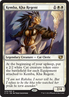
K: I think this card tells a neat story. She’s clearly barely dressed in the art, so you are rewarded for ‘putting clothes on her’, i.e. equipping her. In fact, the more fully clothed she is, and therefore the less objectified, the more she is allowed to succeed in her leadership role. A good card with a good message.
T: I’m not telling anybody how to dress. Clothes, no clothes, it’s all good. You do you. I’m just trying to play a game I like without being forced to reconsider feline anatomy in this way.
T: Whoa. This looks like Megan Fox’s body with Hugh Jackman’s head.
K: What is it about the sexualization of cats anyway? It’s something you see a lot of, and I’ve never understood it. If you like anime, and therefore by extension, sexed up house pets, please explain your weird perversion in the comments!
T: Actually, I shouldn’t judge. I’m not gonna say I never checked out Lola Bunny from Space Jam.
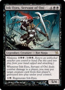
T: Don’t like cat boobs? How about rat boobs? Anything even remotely mammalian is an opportunity for more cleavage!
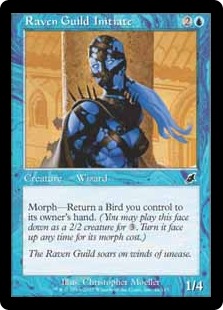
K: I like this one because she doesn’t have any mouth. Here’s one lady who’s not gonna nag you about taking out the garbage or your lack of any interests that involve moving. But Jesse K, you say, I know my Magic history, this wizard is mutated because of the influence of the Mirari. Well I guess we can just all be thankful the Mirari just happened to leave her barely covered hooters in perfect, gravity-defying condition. The Mirari works in mysterious, sexy ways.
T: I try to soar on winds of discomfort with my own privilege.
T: If they made a “Mrs. Claus” for the Grinch, I bet she’d look something like this.
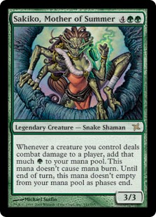
K: Check out those scaly snake boobs in a fur-lined low cut dress. What’s her face like? Who even notices that kind of thing? Probably all the sexier when you remember that her skin would be unnervingly cold to the touch. How far can they take this thing?
K: Oh yeah, it’s this far.
T: The physiology of this creature is ludicrous.
K: Who cares, Jesse T? It’s got breasts, which makes it about 10 times more interesting and probably increases its collector value. At this point they could place breasts on just about anything and I wouldn’t be shocked. At this point I’m half expecting the next image to be some inexplicably curvaceous basic plains. “Put some boobs on it” is Magic’s “Put a bird on it”.
T: I imagine this thing running around with a human torso flopping limply in place of its head like an anglerfish’s lure. It hides behind waist-high objects, waiting to pounce on whoever pauses to gawk at the public toplessness.
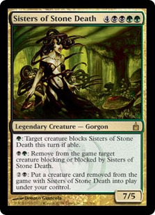
K: What’s hotter than one hideous gorgon who can turn you into a living statue for eternity with her baleful gaze? That’s right, twins! Don’t worry about getting turned into stone, you weren’t going to look her in the face anyway.
T: The real message here is that if a woman’s body doesn’t look like this, she is literally uglier than a mythological creature who is famous for being ugly. I’m actually not sure if women bigger than a size 6 exist in the Magic multiverse unless they’re giants.
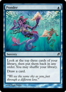
T: Sometimes I’ll walk by a seafood market and just think about how much hotter those fish would be with nipples and sheer lingerie. Fish don’t even produce milk. What comes out of those things, cod liver oil?
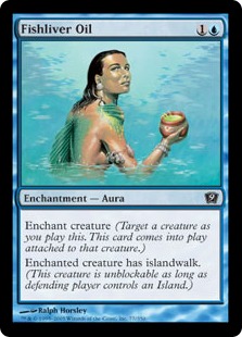
T: Another card featuring a nude woman oiling herself down, apparently.
K: I know this isn’t the time or the place, but what are those clouds doing underwater?
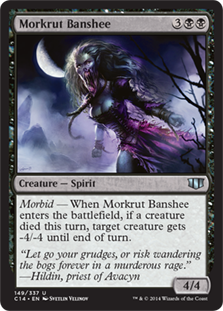
K: Wandering the bogs forever in a murderous rage — Women, am I right boys? Seriously though, why can’t I get a girlfriend?
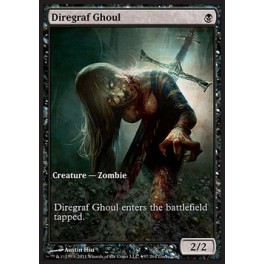
T: Huh. I guess silicone doesn’t decay at the same rate as organic matter.
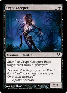
K: This is my least favorite Magic art. Or maybe it’s this one:
K: Same difference, really. It’s a shame that there are enough examples of it that ‘zombie with big boobs’ is legitimate trope in Magic art. Part of what’s so off-putting about it is the combination of attraction and death/disfigurement that it plays around with. Here’s a sexy lady for you to jam your swords through, boys. The other rough thing is the way these images feel so fanservice-y. It’s as if someone looked at a gross monster and thought, “Eh, these are pretty scary, but we could also probably put some boobies on em. For the fans.”
T: It’s really amazing how long this section is. Every time I looked, I just found more and more examples of this bizarre and utterly inexplicable phenomenon. But if you thought that was unsettling, just wait. It gets worse.
Trope #8: Trigger Warning
T: This is probably the actual worst art they’ve ever printed. Garruk has his fist raised, about to strike the much smaller Liliana, with his other hand around her throat, and his leg between her thighs. The misogyny and sexualized violence are palpable. What was most disturbing about this card to me, however, wasn’t the artwork itself, but the reaction of fans who absolutely refused to see anything wrong with it. They acted as though you’d have to be completely delusional to see anything objectionable in this card. Wizards has since apologized and realized why they were in error, but certain fans just keep defending these kinds of choices. Making a mistake is fine (even though this is an exceptionally bad one), but responding to someone else’s pain with denial and false equivocations is what’s really inexcusable.
K: It’s also called ‘Triumph of Ferocity’, you know, as if this argument needed any more evidence to support it.
T: Triumph of Ferocity may be the worst, but that doesn’t mean they aren’t still trying to top it. This artwork, which was used as recently as Vintage Masters, depicts Liliana once again fending off a handsy assailant who’s much larger than her. In this case, it’s a demon peeling off her signature planeswalker tube top. Look at the flavor text, think about her characterization as a “temptress”, and ask yourself whether this is really the best way to develop her backstory. Couldn’t her family just get killed? Couldn’t she just want an evil artifact of great power? Why does she have to get fondled by demons who turn her body into a living reminder of the trauma she survived? Granted, she does turn into a huge badass and go on a quest to kill the demons who took her soul, but none of that is apparent from looking at this single disturbing image.
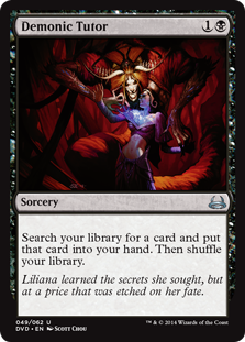
K: I’m so tired of cards depicting the relationship that can form between a Demonic Tutor and his younger female student as something that is always a negative! It’s totally natural and has been going on for centuries #BioTruths #NotAllDemonicTutors
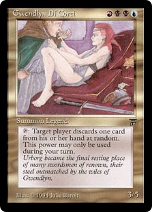
T: Of course, sexual trauma doesn’t only happen to women. In addition to looking like an adolescent metalhead’s crude drawing of his fantasy girlfriend, Gwendlyn doesn’t have her paunchy would-be assassin looking too excited about the fate awaiting him between her legs. If Magic would just stay away from this kind of imagery altogether, that would be super.
Then, Out of Nowhere
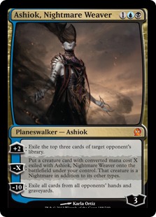
T: In the past few years, we’ve seen a complete 180, and a clear effort to increase the representations of diversity in Magic cards. In terms of gender, we’ve seen an agender planeswalker in Ashiok, plenty of strong depictions of female subjects, and even a trans khan! I won’t say that things are perfect, but they’re definitely on the right track. If they keep up the good work for another 10 years, hopefully they won’t have another Triumph of Ferocity on their hands.
K: It seems like our journey through the history of Magic’s sexist art actually has sort of a positive ending. It really does seem that as time has gone on, either Wizards or someone who works there has developed an increasingly acute concept of what is and is not ok to put on a card. If you’re one of those people who looked at those first few cards we showed with nostalgia, and felt defensive when we suggested there was something wrong with them, take a look at the Magic art in the last few sets. Overall it’s better and more immersive than ever. We’re taking our first few steps into a new, less hostile, more inclusive Magic multiverse, and it turns out that maybe we didn’t need bondage fairies or zombie knockers after all.
T: Thanks for reading, imaginary strawmen! Sorry I killed you earlier. Let’s do everything we can to make sure the game we love is accessible to the people we like.






Jokes on you, I fap to Ashiok (f) hentai.
Interesting article, but this line:
‘In addition to looking like an adolescent metalhead’s crude drawing of his fantasy girlfriend,’
Smacked of a certain smug classism, and seemed at odds with the tone of the rest of the writing.
Where do I start…
The “male gaze” rhetoric pretty much assumes that “sexy stuff” is a bad thing (which it’s quite frankly not) and that only men would ever find said stuff interesting (which is quite frankly false). Who would find a toned woman’s exposed midriff appealing? Straight men, gay women, generally anyone of any gender who is gynesexual. “Male gaze” ignores that there are a freaking huge number of people out there who *like women* and *aren’t men.* Like me, for instance. I know a lot of not-males who would consider risque or sexually appealing artwork/image/text to be a *point of interest* in a piece of work, whether that be a game, comic, whatever. Are these characters dressed to titillate? For sure. Is that *actually a bad thing* however? I disagree. This is a *fantasy,* an idealized creation of someone’s imagination. Nothing is real. People can have whatever kind of fantasy they like, I don’t care, but trying to force some sort of real world value onto a made-up fantasy is just stupid. If drawing and liking pictures of naked women that are designed to be sexy makes me a sexist misogynist, well then I guess I’m guilty as charged, and proud of it too. Human sexuality is something to be celebrated.
And personally, I really don’t see how that can drive someone out of their hobby. Does a large-breasted vampire *need* to be featured on the card art? No, not really. But she *is* and I’m perfectly fine with that, cause vampires are pretty damn sexy. I do think that taking offense to a pair of nice boobs is a *personal* issue that you need to think over and deal with. If it makes you uncomfortable then think about why, and how you can deal with that, and defeat it, cause it will do nothing but restrict you. As a long-term sufferer of social anxiety and general fear of people, I know what I’m talking about. Thinking this way does nothing for you, it’s not good.
The Triumph of Ferocity analysis is just pretty far-fetched, honestly. They’re trying to kill each other. Liliana is *shooting a fireball into his face.* Replace the characters with two men, two women, or even reverse the roles and there is nothing wrong. To claim that the card displays and promotes sexual abuse purely because a man is pinning a woman against a rock while trying to kill her is pretty ridiculous in my mind.
And before you ask, yes, I do like the new additions to the card lineup. I’m not against equality of representation, I’m against demonizing the poor bondage fairies There are a great varieties of strong representation for characters. Physically, mentally, magically powerful, and so on. Even sexually powerful (look at Bayonetta) is an option. Everybody likes different things, wants to see different things, wants to play as different things, and that will be reflected in the game. Demeaning others because they enjoy things that you don’t won’t help anything.
And in specific reference to the first paragraph, I’d prefer it if you didn’t try to dictate how I should feel about vampire boobs. Cause I *am* excited by the prospect, and I doubt that’s the reaction you believe to be “correct.”
- A Gay Anime Girl
Hey! Just wanted to say thanks for this article! This is an aspect of the game that definitely needs to be an ongoing discussion rather than being briefly discussed when a problem card arises. I brought my wife and mother-in-law into magic and have benefited from their insight on what I had glossed over as par for the coarse. I think there’s a difference between sexual and sexualized, and zombie-cleavage and fish mammaries are definitely in the latter and are unneeded in Magic.
Thanks again for the article! Great stuff!
Hi all, thanks for the comments so far. @Gay Anime Girl, I wanted to specifically reply to some of your points- ‘male gaze’ is an imperfect term for what we’re talking about here, and specifically it’s more important that the depiction is de-humanizing and turns the subjects into objects. Something can be sexy and sexualized without being problematic. Maybe ‘patriarchal gaze’ would be a better descriptor. I feel like it’s important that we’re supporting the kind of depictions we want in our games and hobbies, because all put together they do end up leading to an overall impact on the way society views and treats women.
re: Triumph of Ferocity- I have no problem with a male and female character depicted in a battle, but there are a number of ways the art on this card could’ve been done more tastefully. For example, does his leg need to be pressed up between her thighs? Does it have to be rainy and wet to sexualize the character as she’s being beaten up? Does he have to be attacking her by grasping her by the throat and punching her in the face, in a distinctly non-magical way that is very evocative of domestic violence? It would be better if he were using some kind of magic, or even swinging his trademark axe at her. This image was triggering for a number of people, and although I don’t think this was the intention of the artist of art director, someone could’ve stepped and said ‘we should rethink some aspect of this’.
-Jesse K
Hey, two Jesses, love your humor and most of your jokes, altough I have to admit they are not always as well chosen as you demand of Wizards for their card art
This first comment aside, I really like your view on magic cards. And this article surely hits at an embarrassing point of the game from a nowadays perspective. This game started over twenty years ago, so it’s natural some public views may have changed, as well as players may have changed. I’ll admit I laughed my share when wizards corrected the Nissa Revane’s artwork on a later releaesed promo card to a correctly closed body; and one part of me then just thought how politely correct one need be these days. But the other part of me then and now thinks how ambivalent this correction was in regard of all the other oversexised cards printed.
So, in short I also like the new take on the art by Wizards. I think fantasy art should aim more in direction of a possible reality, like the TV shows us in A Game of Thrones or also in Lord of the Rings. It might have been kind of funny twenty years ago to see a fighting female sex bomb in battle with just her breasts and shins protected by mail, (whereas men mostly are whole body protected). But nowadays we all know where from such stereotypes origin («patriarchal» is a good term for it), so we better let them aside in favor of a possibly bigger audience for this great game.
@Gay Anime Girl: I can see your perspective. And it might even ocure there are some nerdy female magic players that like all the muscles of magic art’s male heroes, I don’t know. But it’s just a fact, that this game as many others narrows its possible audience down to a group of people who like its background stories and/or art. In other words, it totally doesn’t attract all other people who don’t like the game’s flavor or worse, are offended by it. I can’t proof it by statistics but I feel like one part about not attracting more women to the game is its «nerdy cliché» take on fantasy worlds. My experience tells me there are just a lot less women than men who like this «nerdy cliché» take. So my answer to you is: sure if anybody has a problem with any aspect of the game, better leave it; but as its really one of my favorite games it’s just a shame I can’t get more of my female friends to it, or when I’m trying, have always to state out «oh yeah those arts have some pubertal aspects, but just ignore them, after all it’s a great game, isn’t it?» And to your main point: Of course some «sexiness» is also ok in a nowadays game art, as in the «Game of Thrones»-example you could still go way over the top with reality-closer pictures. And for a game for age 13+ «Game of Thrones» is certainly a bad example for the overall sexiness. I think it’s certainly ok to show well built people, beautiful bodies and so on in fantasy art, but why that so often in such unuseful fashion? The trick would be to show «fantasy» Beauty in a «realistic» environment, and in «realistic» fashion.
Two Jesses have just added another important aspect to the recently anew startet discussion about women driven off the game. Thanks.
Mtgo is better than computer games in regard to the boobpocalypse. It’s not perfect but I feel you are coming down too hard the other way, and what is the actual ratio of normal depictions of women to pinup depictions in magic art, is it actually that skewed? All the women I’ve known where not put off by the nudity just by the violence / competitiveness .
[Don't use racial slurs, even for (perceived) comedic effect.--PlanetWalls]
At this moment in time, most players prefer sexy art-work; that’s why Wizards makes the art the way they do.
The solution would be a reduction in demand for objectifying art-work- that is, convincing doubters in the player base that the objectification of women on Magic cards does more harm than it does good- and we should all pitch in and pay a price, in the form of reduced enjoyment on some of our parts, for the sake of the offended demographic. So what you need is persuasion, information, and truth.
I don’t think this article is going to persuade anyone- it’s insulting to the people who don’t agree with you, and it makes fun of some good, sexy pictures, but that’s about it. I’m still unconvinced of the harm done to women- they’re portrayed in a (perhaps unrealistic) way that inspires desire, but not hatred; some people prefer that, and I think the rest are indifferent; you improve the lot of some people at no-one’s expense, and it would be the same if women made up 90%.
I was surprised not to see Vampirism in the “Naked for no reason” section. “Vampire threatens a group of defenseless humans” is a fine start to the depiction of such a card, but for some reason someone decided the best setting for this scene would be “all female nudist colony in a cave”. What.
Well this was a neat read. I disagree on some points, but overall, yeah, magic’s reputation isn’t entirely undeserved.
The biggest disagreement I have is that I think sylvan paradise is a very pretty card, and the nudity exists as a way to show a oneness with nature, and to give an Eden-like quality to the scene.
Funny, the old Demonic Tutor art got flack for depicting a pentagram, followed by Wizards being gunshy about printing any demons for a very long time.
Then they said “screw it!”, printed Grinning Demon and many more awesome demons, and now we’re complaining about a little peek at cleavage on the new Demonic Tutor.
To me, if they wanted Liliana to screw a demon that’s the true offense. Not depicting a subtle hint + flavor text about it. But even then, there is a mountain of demon/vampire erotica written primarily for women, so this might not be a purely “male gaze” issue.
One aspect of the objectification concept is that oppressors in our culture are either intentionally or unintentionally removing the humanity from a minority group in order to deny them equality, and therefore conserve the power imbalance.
As to the effect this has on 13 year old girls, magic’s not as pervasive as watching a shampoo commercial on the tv, but it still needs some sunshine.
As to this article, there is no one who is writing this. Bravo. Brav-freaking-o.
Appreciate the well thought article. I think there is a place for love, nudity, and even sexuality in a card game, just not all on the same card. Sylvan Paradise is an example that I think you were overly harsh on. It’s a classical nude in a lush environment, the nudity is the classical sense that it evokes a person that is free from the bonds of civilization.
My main issue is tasteless fanservice, particularly the hideous art that goes on commons seemingly as a matter of hitting a quota. I despise fierce orcs, beastwomen, witches, and zombies that display boobs for no reason in an artless way. Clothes which exist to tear away in the artistic moment are softcore porn uniforms.
Still, there are times when it is called for in canon, in the case of merfolk, faeries, centaurs too much clothing would be as unsettling. Vampires have a long history of wearing revealing clothes, there’s a way to portray this without it being a 14 year old’s wet dream.
Magic says it want to diversify its base, which seems a noble goal. Considering diversity in artists will be a big part of it, the art of Rebecca Guay has always brought its own flavor to Magic. Let’s seek more artists with individual styles and fewer fanboys who came up short in their dreams as comic book artists.
This is an interesting article. While I think in general, it is a bit too harsh (but then again, maybe it has to be to be taken seriously?), it’s a good point to make. However, I would like to point out that one of the main points of the article is that Wizards is responsible for the art, where as that is not totally accurate. Wizards commissions most of it’s artwork from independent artists, who make a lot of the choices on how the art is done. Wizards does make a style guide for it’s settings, and gives a brief art description for it’s commissions, but there is rarely any real detail in that. Wizards could crack down a little harder on accepting risque art, but since the art is already paid for by the time they would be able to do so, it would greatly increase the art budget. For a game that (for most of it’s history) has struggled to grow beyond a niche market, that would be a pretty big blow to their bottom line, as well as greatly complicating the process (which is under time constraints) of releasing sets.
Long story short, the criticism should be angled more toward the artists (or the culture that influenced them) than Wizards itself.
+1 about the lack of beautiful male angels. Given how many of them are rare, we must assume that beautiful, semi-clothed females are beyond most reach, with no hope to obtain beautiful semi-clothed angelic males.
-1 about the negative dig against some artists fantasy girlfriend. You drank the Kool-aid you just rallied against with such a sexist dig.
Overall, good way to draw attention to the sexual objectification in MtG. What’s next, though? You brought attention to it, so your next steps are, what, exactly- just complaining? Has WotC issued any statements you can quote? What did they say about this article? Can we have a linked quote to anything the business has said?
Starting with Earthbind was a good example. You had some categories that were reaches, like the anthropomorphic creatures with larger breasts. Seeing the original art for Keeper of the Mind was enlightening. By the time I wound up at Troupe #8, I lost count of the accusations you levied against WotC, or at men, in general, it seems. Triumph of Ferocity should have lead this discussion, soon after Earthbind’s picture to show history from 4th Edition+ (and earlier, but 4th Edition is where a lot more people jumped on board).
Insightful, but no calls to action or intended plans going forward. What now?
I think a lot of your comments are very funny, and you guys are very entertaining, even though I can tell we do not have the same views on fantasy art or the culture-at-large.
Earthbind was totally within the realm of ordinary fantasy art in 1993. I think the card highlights a generational divide between older fantasy fans and younger ones.
But I don’t disagree that Earthbind is out of step with contemporary fantasy art. Chosen of Markov, OTOH, is not about capture, it’s about surrender and power. That art is expressing a type of sexuality that clearly you guys don’t like, but that a lot of men and women DO like, that is central to the portrayal of vampires in media for decades, and it’s doing it completely tastefully. Vampire movies have had this “sexual power” dimension to them from Bela Lugosi through today. Hell, if you look at her expression on the flip side of the card, you could interpret the “story” of the card as her having manipulated the vampire that turned her so that she could gain power. You can’t really write off the card as being about “objectification” and pretend she has NO agency here, unless you are really that deep down the rabbit hole about “power structures” and all that Sociology 101 stuff. I don’t begrudge you your own opinion, but TONS of young women (my own wife included) watch those vampire shows on TV, they love those shows, and that kind of sexuality is rampant in those shows and their legions of female fans from teenagers to 40-somethings don’t seem to have any problem with it.
I’m not saying this is the artistic direction I want for the game, but it’s not my opinion that counts, nor yours. FWIW, my preference for the art direction would be to diversify the acceptable styles — my two favorites all time are Rebecca Guay and Quinton Hoover, and I’d rank Terese Nielsen the best of the remaining old guard, and the game has totally pushed anybody with a truly distinctive style to the fringes in favor of bland uniformity in the name of marketing and world-building. The fact that all these recent cards just look like mediocre comic book art, instead of actual unique pieces of art you would want to buy, is the real crime.
I was a original player from a Alpha release oh those many years ago. I’ve recently returned as a limited player and have noticed a very positive change…buuut the current sign-in screen (as of Aug. 1, 2015) for Magic the Gathering Online is an upshot of Liliana with a freaking see-through top (including nipples) and several grasping, body-less arms…le sigh.