Summer is upon us, but that doesn’t mean we can’t cool down with some icy early Magic flavor. In this first of our two-part series we’ll be taking a retrospective look back at the art and flavor of Ice Age.
T: Climate change can come upon the world unexpectedly. That’s why, for our first article in a Series of Complete Nonsequiturs, we’ll be looking at the artwork of Ice Age. Come with us as we go back to an age when the winds of Dominaria were so thick with snow, that one member of the creative team could barely communicate with another. What’s a Balduvian? Why is there an evil lemur? These, and other questions would not be answered for eons to come. Through the miracles of modern imaginary technology, let us peer back into the ancient past of the multiverse. Before there was the style guide, before there was block design, there was Ice Age.
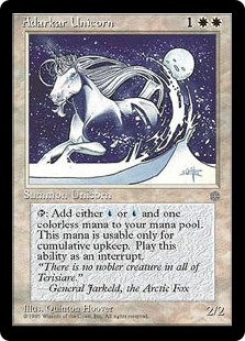
K: Let’s start with one of the rare art successes of Ice Age. I love most of the Quinton Hoover pieces, and he represents (along with a few other artist we’ll get to) the much wider range of artistic styles that used to be acceptable. We’ve gotten a little better recently, but abstract representations or illustrations in different art styles largely fell by the wayside in recent years. This is a nice, evocative illustration that would not really feel at home in a modern set. The card also highlights another standard of this set, cards that have abilities that are not even slightly represented in the art. Actually forget about art, some of these cards really lack a coherent design at all. This is a unicorn that helps pay your cumulative upkeep because… that’s something unicorns are good at? Maybe at some point in this flavor review we’ll figure out what cumulative upkeep is meant to be representing (but I wouldn’t hold your breath).
T: This is the first appearance of General Jarkeld, the Arctic Fox. Not much is known about General Jarkeld, except for his well-documented love of unicorns. The Adarkar Unicorn lives among the snowy plains of Terisiare, and I always assumed that was where the blue mana came from. You can only use it to pay cumulative upkeep because snow doesn’t work as well as water, and Magic‘s designers hadn’t yet discovered that mechanical drawbacks aren’t fun to play with.
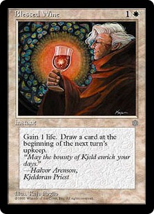 K: Another great example of a card that benefits from the stylistic ‘flexibility’ of early Magic. The stained-glass inspired illustration fits the name and concept well. As for why this card, and many others of its time, had you draw ‘at the beginning of the next turn’s upkeep’, I can only assume wine-induced madness had something to do with it.
T: This sounds familiar. Drink some wine, gain a life or two, wake up the next turn like “Where did this card come from?!” Man, those were the days. Too bad everyone who ever lived in Kjeldor has been dead for thousands of years. I miss those guys.
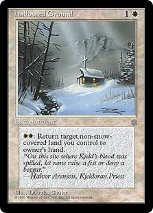
K: You kids have it so easy these days. Pre-Avacyn’s Collar age we didn’t have any stand-ins for the crucifix, and we didn’t need ‘em. When you wanted a religious symbol you just used a real world one, and let the confusing implications be damned (sometimes literally). This card raises a lot of questions about whether or not Jesus existed in Kjeld for some period of time, but also about why they would need to print a card with such a strangely specific ability. Woah, woah, we don’t want to let it return snow-covered lands too, then it would just be broken!
T: Clearly it’s for flavor reasons. You can’t target a snow-covered land because it needs to be shoveled first. If Jesus were a Kjeldoran, the way we celebrate Christmas would suddenly make a whole lot more sense.
T: I like that they used to be willing to print cards with convoluted abilities that were purely there for flavor reasons. This card very clearly represents a skittish horse. It’s a real shame that I don’t know or care what a hipparion is, so a clever design is completely lost in the execution.
K: Location: Wherever (do some snow maybe?)
Action: Draw a horse that sucks
Mood: Annoyed at a horse
K: Ah Seraph, back in the days when being an Angel was enough for a card to be exciting. The thing that stands out to me the most in this card is that the illustration appears to be based on a favorite 4th grade teacher, or perhaps a friend’s mom. Well, that and the fact that there’s no background. We’ll see more of that little art trope later.
T: Rememberest thou to return thy books to the school library on time, or thou shalt be slain, and in death thou shalt serve thy God! If there’s one thing angels are known for doing, it’s gotta be raising the corpses of enemy dead.
K: Check the oracle text, this is what a creature type – human wizard looks like in Ice Age. Also, that gyrating icicle that he’s waving at is a 2/2. The thing I’m getting the most from these cards, design-wise, is that they really wanted “snow-covered lands” to matter, but they weren’t sure how or in what way. Thus you get a lot of cards like this, but also cards that punish snow-covered lands, as if minor benefits like this would be too good.
T: Much like the Phyrexians, modern Magic design is a ruthlessly efficient machine that would have rooted out any such aberrations long ago. Starting with Tempest, all style guides now explicitly specify whether humans on that plane have exoskeletons or not.
K: Humans: a bipedal, mammalian race similar to humans on earth. They have their bones inside their bodies.
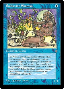
K: People complain a lot about the complexity of the commons (yes, you read that right) in Ice Age, but at least this card’s ability is perfectly expressed by the art.
T: I wonder if it’s possible to reverse-engineer the original description of a Balduvian that was given to the artists. Based on the disparity we’ve seen so far, the best I can come up with is “Some kind of bone wizard.”
K: By the way, a quick check reveals that the number of things this card could affect in Ice Age Block was a whopping 13, which is actually a lot better than I thought it would be. Unfortunately, 5 of those are the scarabs, and another 5 were the circles of protection (that art!). As for the other 3, getting blue caribou is not such a payoff, but it is a sicko combo with both Justice and Reclamation (another major theme of Ice Age is using super good names for nonsense garbage cards). Overall, I give this guy a limited rating of 4.0, pick highly.
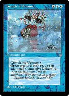 K: Yeah, so this card. The Foglios are responsible for some of the most distinctive art of Magic’s early days, but they turned in some real misses as well. I don’t really have much to say about this card other than to show people that this art exists on a Magic card.
T: The only conclusion I can draw from this confusing illustration is that the supernatural bath house from Spirited Away was actually located on Dominaria, and at some point they defeated General Jarkeld in battle.
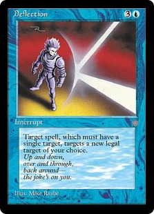
K: Along with a nearly “I’m rubber, you’re glue” level flavor text, this card is a great showcase of no background syndrome that many cards of this age are afflicted with. Also, the artist appears to have forgotten to color the central figure in the art (Vegeta? Is that you?). Eh, I guess the visual focus is on the deflection itself, and any other details would just detract from that.
T: To be fair, backgrounds are pretty hard to draw. It’s a little-known fact that most of the spells depicted in Magic actually involve saying magic words, and this is one of the rare instances in which they were actually printed on the card itself.
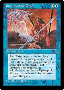
K: Just some normal art on a normal card. You could ask questions like, “Why is this reanimation spell blue?” or, “How does Tarzan fit into the Ice Age style guide?” or, “Why is this an uncommon?” but then you’d be missing the point. If you really want the Ice Age experience, you have to just let the cards wash over you and accept them uncritically. Consider this a warmup for when we eventually make you read Ice Cauldron.
T: Some of these cards have such specific, convoluted abilities that they could only be top-down designs gone wrong. Target white or black creature? Cumulative upkeep? No single person could have botched a card this badly on their own. This took teamwork. Even the artwork seems to say “Look, if you’re not going to try, I’m not going to try.”
 K: This card looks great! Defying all odds, it seems like someone actually talked to Rob Alexander about the setting and themes of Ice Age before he illustrated this card. This illustration makes a strong case for the visual aesthetic of a predominantly icy world, which is sadly lacking from a lot of these cards.
T: Technically, this artwork could just as easily be depicting the tropical coastline of Jamuura. I think they just got lucky.
K: It feels like I’m at a Pink Floyd laser light show at a planetarium and I’m loving it. Aren’t all walls, like, illusionary, man? When a piece of art feels like it could go equally well on either a blacklight poster, or airbrushed onto the side of a van, you know you’ve got a winner.
T: You might be wondering how this wall has first strike. The answer is, it’s an illusion. The real wall looks nothing like the wall you see. In fact, that isn’t a wall at all. It’s a painting, and you’re looking at it on a computer screen. The real wall is already behind you.
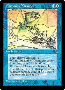
K: This illustration tells a great self-contained story, and even goes so far as to be a serviceable top-down explanation of why a blue spell has “gain 20 life” written on it. When I got my box of Ice Age for Christmas (true story) this was one of the cards I was most excited to open, and I like to think the cool art was a partial reason for that.
T: Some of Dominaria’s most powerful blue mages are rabbits, pigeons, and other sundry small animals. Once their planeswalker spark awakens, they can travel through interplanar rifts via top hat. This is definitely one of the most flavorful cards in the set, even though it has absolutely nothing to do with the setting.
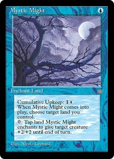
K: “Hey, cool picture of a purple tree, I think I’ll put this on a Magic card. Which one? Doesn’t matter!” -Magic Art Director, circa Ice Age
T: I assume the artist painted this just after a mighty mystical creature knocked them to the ground. This is clearly supposed to be a green card, by the way.
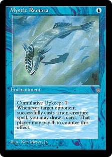
K: Could this have possibly been their intent when designing this card? I mean, I love Mystic Remora, so I’m not complaining, but come on. It’s a goofy looking fish (feat. tire tracks on his head) who somehow corresponds with drawing you cards when your opponents play spells (but only non-creature spells). Of course the Remora can also be satiated by your opponent paying 4 mana, and must be paid in increasing amount of mana by you for his services.
T: You’re not fooling me, Wizards. You can’t just call something “mystic” and expect me to start oohing and aahing. That’s clearly just a regular remora. In fact, I think it might be slightly defective. Its shadow is swimming the wrong way.
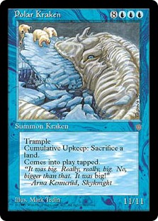
K: With many of these cards, I’ve been at a loss for how to describe what was going on, being reduced to simply pointing out the absurd things pictured and throwing up my hands in disbelief. Not so with the Polar Kraken! At the time he was printed, he was the largest creature in Magic, and this art does not disappoint. Look at what a badass he is. He doesn’t even care that he’s eating a giant iceberg. Polar Kraken wants those polar bears, and no amount of ice is gonna stop him. Love the polar bear taking a pratfall off the top too, looking like he’s in a coke commercial. Looking at the difference in quality between this and some of the other somewhat more suspect art pieces, you get a real appreciation for people like Mark Tedin and Quinton Hoover, and for the ability of the early Wizards art department to recognize and retain talent.
T: In case you’re a new player, and you weren’t aware that you were looking at the biggest creature ever printed, the flavor text really makes sure to spell things out.
K: If we were giving away an Ancient Grudge Commemorative Worst Flavortext Award, this would be a strong contender.
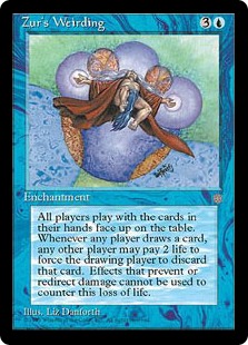 K: Once again, Wizards returns to their early design maxim of “Sure, blue can do that.” However, that’s not nearly as significant as the bathrobed wizard upskirt that they went with for this illustration. See my prior comment about being at a loss for words, although you could see this as a brilliant evasion from an artist who didn’t want to define Zur’s appearance so that he could be safely retconned into something else later.
T: You might be wondering what “weirding” is. This card has been printed several times, and all we know for sure is that it involves an old man in a bathrobe, a greedy king, a giant floating eyeball, an elvish dominatrix, and a space alien. As for Zur’s face, it’s possible that it can’t be depicted in artwork for religious reasons. Could we have found Jesus’ alias on Dominaria?
K: I nominate this card for the greatest gulf between concept and execution award. When you hear the art description — a black armor clad figure with antlers, wielding a flaming axe, riding a spectral ghost skeleton unicorn with flaming hooves — heck yeah, you want to see that illustration. Then you look at this, and somehow it falls short.
T: More like abysmal specter. Look at those tiny hands! There are no gates pictured (or any landscape features of any kind, for that matter), but this flavor text is clearly important enough to warrant inclusion.
K: Ron Spencer’s another Magic artist whose stood the test of time. Although his densely packed, gore-heavy, Todd McFarlane-esque illustrations have never been my favorite, there’s usually a higher than average level of quality. Therefore, I have to assume that the bizarre pose and implied lack of hips on this thing is intentional, which raises its level of spookiness immensely.
T: This is one of the few cards in Magic that cares about the order of things in your graveyard, which begs the question: Did they even playtest back then? A lot of these designs seem so clunky and bad that even a single playtest would have revealed it. In any case, I’m glad we live in a world where they don’t print cards without reading or looking at them anymore.
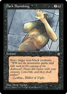
K: I think I just straight up like this art. Sure, it’s a little hazy and abstract in its execution, but I think it captures a mood well. Compare this to more modern removal spells in which what is going on is clearer, but much less compelling.
T: What do you mean the other kids at necromancer school still won’t take you seriously? Did you tell them the thing about the mountains quaking and hills melting? And nothing? That’s fine. You just banish them to the “Take On Me” music video, and then they’ll know.
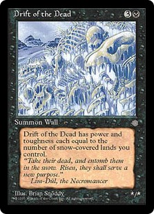
K: Card name: Drift of the Dead. Okay, I’m with you so far. Card art: A pile of frozen corpses and skeletons. Good, good, I think I know where this is going. Card text: Power and toughness equal to… your snow-covered lands? I feel like this is a clear miss.
T: The themes of this set are snow-covered lands and cumulative upkeep. An entire team of designers thought those were good ideas. That actually happened.
K: Maybe like a bunch of cards had normal text and then someone was like ‘not enough things care about snow-covered lands’ and went through altering cards willy-nilly. That would be a better explanation than thinking that someone actually designed this card like this on purpose.
K: Nothing to see here, just an almost unblockable 2/2 for 3 mana with significant downside. This card is a rare, by the way. Just 2 years later, they would print Phantom Warrior, which is the same thing without a drawback at uncommon. I guess you pay a premium for getting to look at this lovely and appealing artwork.
T: Unless that fly is actually a giant fly, this doesn’t look like an abnormally large amount of maggots to me. I’ll go on record as unimpressed by the maggots.
K: Gross. This has to be some of my least favorite magic art of all time. Just can’t really deal with the whole sliced eyelids thing. Add to that the clown theme that is bizarrely and unnervingly present not just on this card, but throughout the set, and you have a card that can only be described as nightmarish.
T: Without getting into any convoluted rules text, what does this card’s flavor text have to do with its name and illustration? Remove the guardians? Is that some sort of coded message?
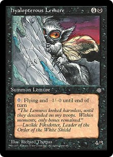
T: The story behind this card, as many of us already know, is one of the reasons the style guide was invented in the first place. The artist was asked to draw a lemure, which is a Latin word for ghost. Having, like most of us, never heard that term before, the confused artist drew an evil, winged lemur. Even more bizarre, they correctly understood and depicted the “hyalopterous” (glass-winged) part of the creature, indicating a strong grasp of Greek, but not Latin root words.
K: I love this card, and I think the illustration turned out great, despite it being an actual legit art mistake. This happens so rarely (but not never) nowadays, that it’s actually just refreshing. I like how the flavor text tries to pull a hail mary and save this from being entirely incoherent, but ultimately the fun for me is in the error. Another fun fact is that someone on the Time Spiral art/nostalgia team decided to give Lemures” another go, complete with flavor text mocking this card.
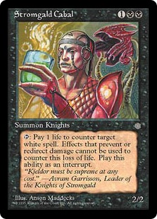
T: Ohhhhh, you said you wanted no ice. Like in your drink. I see. Sorry. Bad choice of words.
K: While Ice Age fails a lot of the tests of modern design and art direction, it was astoundingly accurate in predicting what the hipster bar scene would look like. This guy’s about a handlebar moustache away from serving me a Moscow Mule in San Francisco.
T: Well, I’m already feeling spoiled by modern design. I can’t wait to take a look at Magic Origins just to see how much better things have gotten. There will still plenty of inexplicable art and ambiguous creative decisions when we return with part 2 of our Ice Age excavation. Thanks for reading!








Just wanted to leave a short comment about your series. I really like your flavor reviews and find it a refreshing change from the play videos. Please continue making these articles!
I’ll second that. I only come to this site for these reviews now Oh and if planetwalls, but he doesn’t do many videos anymore
Sorry, Ned.
I like Drew Tucker. Old magic cards looked cool.