Dracula (?): Blah! Blah! Velcome, Children of the Night, to the Eldritch Moon Flavor Avards! Haha, just kidding, I’m not Dracula, I’m Jesse K. It’s a regular monster mash here at the awards tonight however, so don’t tell Dracula I did that impression. He hates impressions. Also, stay away from the punch, I think I saw a werewolf scooping it out with his bare hands.
Jesse T: There are a lot of questionable things about this party. I’m pretty sure that DJ is an Eldrazi. Also, whose idea was it to host the awards in the backyard of Liliana’s mansion? Did you know she won’t let guests inside to use the bathroom? Let’s take a look at our first category and see some of the other places on Innistrad we could have rented just as easily!
Achievements in Art
Best Land Art
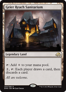
K: There aren’t many lands in this set, but thankfully we’re still not starved for options. The Sanitarium captures the moody, gothic horror that the plane was originally known for so well, but check out the background and you’ll see that that’s not all that’s going on. It’s also a pretty great mechanical representation of a mad house, since it enables madness and delirium.
T: Finding good mental health care on Innistrad can be difficult. How many times have you or a loved one checked into a mental health facility only to discover that it’s actually a front for an organ-harvesting scheme run by vampires? That’s the Geier Reach difference. We are not a trap. Our facility is run for mental patients, by mental patients. Geier Reach Sanitarium: All are welcome.
Best Nonland Art
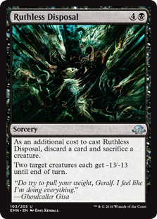
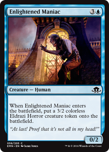
K: Harmless Offering is to me one of the true flavor home runs of the set, but it’s really the art that sells it. In fact, we just wrote a whole article about how great this cat is, so why don’t you check it out. Other pieces I appreciated included Enlightened Maniac, which uses composition and light to great effect. The smudgy, impressionistic Ruthless Disposal could’ve been done in a gross-out style, but artist Dave Kendall gets more mileage out of implying rather than showing.
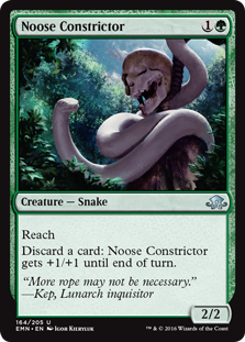
T: My personal favorite is Noose Constrictor. Not only is it a richly detailed image with a striking color scheme, but it’s going to look really sweet tattooed across my neck. The best part about being a planeswalker is you don’t need to go to job interviews anymore.
Spookiest, Scariest Monster
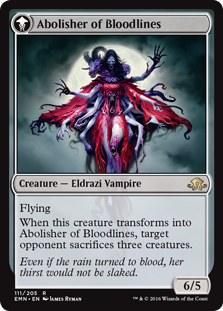
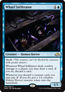
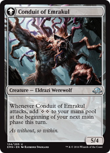
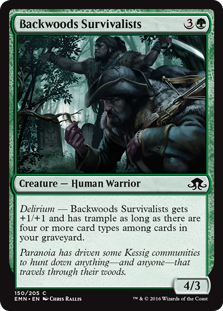
K: What good is a monster movie without a monster? While my favorite is probably the nightmarish katamari of limbs that is Abolisher of Bloodlines, I appreciated the apparent callbacks to more recent horror classics that seem to be sprinkled throughout the set. Many of the Emrakul’d werewolves seem The Thing-inspired, and I imagine that Wharf Infiltrator is only lacking “we all float down here” flavor text because there wasn’t room on the card. Finally, Backwoods Survivalists offers a very timely reminder that there’s nothing more terrifying than angry, paranoid men.
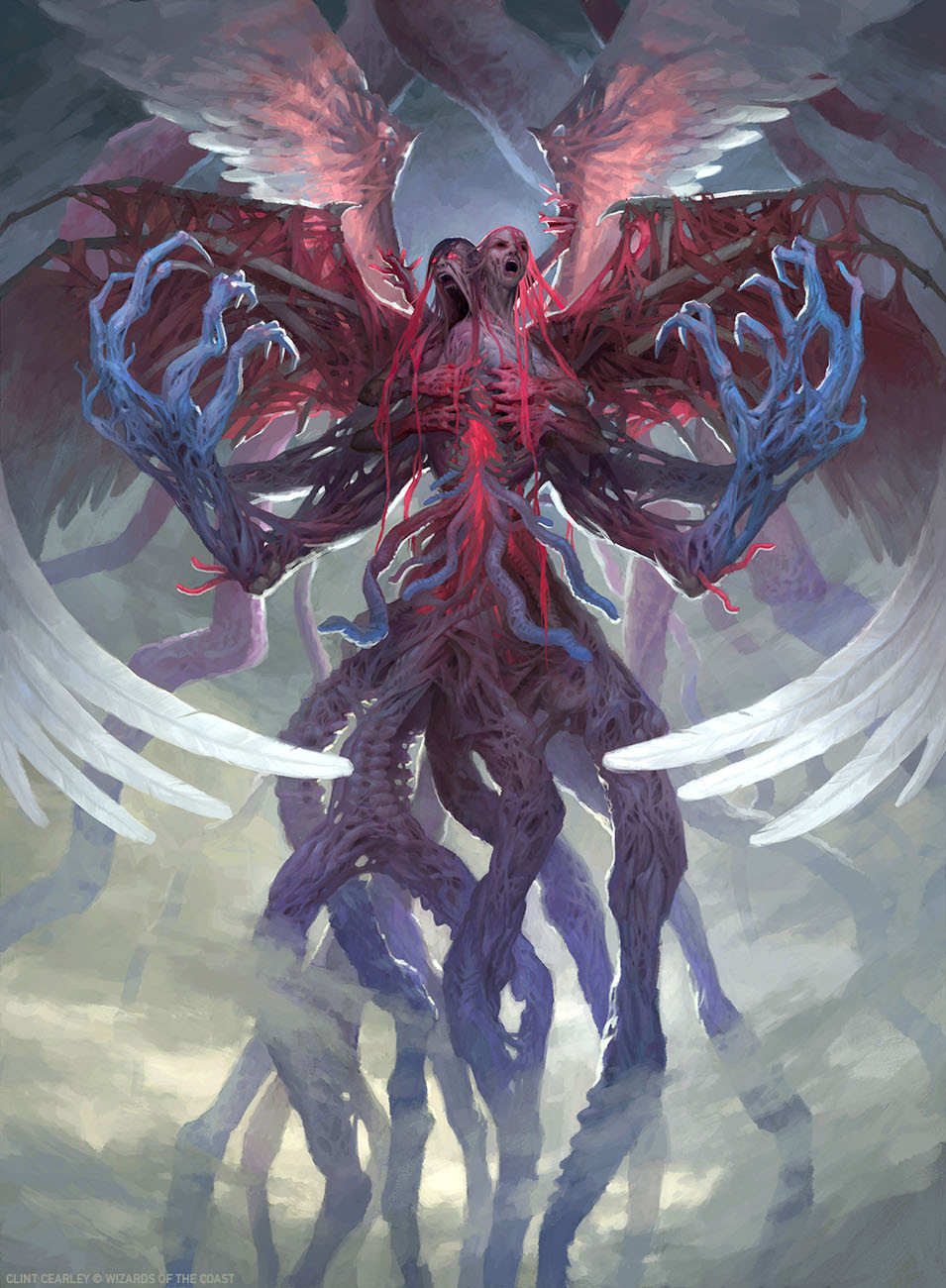
T: Abolisher of Bloodlines may be a horrifying chimera, but it looks like a harmless chimeric kitten next to Brisela. This unholy two-headed fusion of flayed humanoid carnage is truly the stuff of nightmares, and this angelic voice now screams only for its own death. Now that she’s won the Spookiest Monster award, I hope all of her dreams have finally come true, and they will stop manifesting in physical reality.
Least Spooky and/or Scary Monster
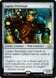
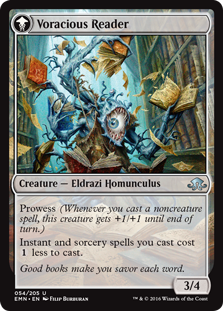
K: Lupine Prototype might have fallen into the uncommon trap of being too cool to be scary. Personally I’m hoping that wolf-bot is our protagonist on our next inevitable trip to the plane. However, he’s still not the least spookiest. If there’s any horror that’s likely to get shoved into a locker, it’s Voracious Reader. I can’t think of one decent monster that had ‘loves reading’ as a defining characteristic, and there’s a reason for that. I love the art and the concept here, but he’s more wacky than scary. Besides, he seems to really only pose a threat to your collection of valuable, first-run, signed novels.
T: Doesn’t Frankenstein’s monster like reading? And the greatest monster of all, mankind? A voracious reader doesn’t scare me at all, but the alternative, an uneducated mind, sure does. It’s pretty ingenious to put a wolf in a mechanized battle suit, but only a true fool would forget to equip it with a chest-mounted machine gun and an electric guitar. To the disembodied wolf head’s credit, it does do a pretty good impression of Robert Downey, Jr.
The Hunt the Weak Commemorative Worst Art Award
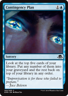
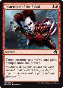
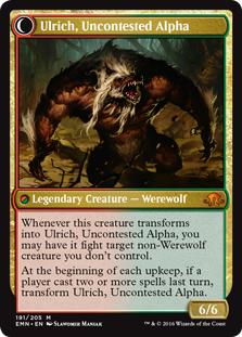
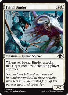
K: Rule number one of budget horror: Don’t let people get too close of a look at your monster. Fiend Binder’s art is probably my least favorite on a technical level. The Eldrazi looks terrible and the binder herself is doing something that looks ineffective and confusing. Distemper of the Blood also features a ‘what is going on’ problem for me, as well as highlighting the least successful version of vampire design, the pale foppish type. Ulrich also fails hard at being scary, looking like he’d be more at home on a VHS box in Blockbuster’s horror section circa 1994. However, I just wouldn’t feel right if I didn’t give the ultimate bad art award to the piece that features not only a Jace mega-closeup, but two additional Jaces. It’s a full blown ‘3 Jace Moon’ situation on Contingency Plan, and I am having none of it.
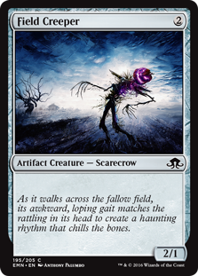
T: There are plenty of strong candidates for this category, from Fiend Hunter’s starfish-with-a-human-face to Ulrich, who looks like unused concept art from James and the Giant Peach. They’re even trolling the two us specifically with infinitely nested Jaces! In my mind, however, the award has to go to Field Creeper, which is literally just a stick figure with a smiley face on it. I’ve seen better drawings scribbled in the margins of textbooks. I’ve seen coffee stains that more closely resemble the human form. Like so many classic horror movies, Field Creeper proves once again that just because something is in black & white doesn’t mean it’s good art.
Achievements in Flavor Text
Most Intentionally Funny Flavor Text
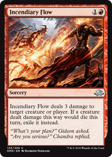
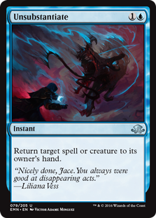
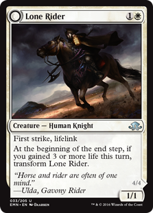
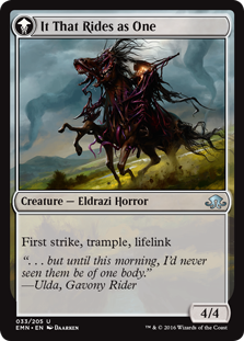
K: There are some great snappy little one-liners in this set. Chandra earns a rare laugh on Incendiary Flow with a meta quip, but ironically the sickest of burns belongs to Liliana. The quote on Unsubstantiate was enough to make me glad she joined the Gatewatch, just for the possibility of her constantly calling out Jace for being the multiverse’s preeminent f***boi. Highest honors for me, however, go to the Dual-Faced Cards, many of which have more involved set-up, punch-line structures made possible by the natural gap between reading the front, turning it over, and reading the back. Smoldering Werewolf, Tangleclaw Werewolf, and Grizzled Angler all pull this off fairly well, as does Lone Rider. Way to put that new technology to good use flavor text writers!
T: Brisela isn’t the only thing in Innistrad with two faces! Those Eldrazi werewolves are real knee-slappers, and not just because of the crude hand-like appendages growing out of their thighs. I hope this isn’t the Gatewatch’s finalized roster, because the creative team really has their work cut out for them if they want to make a character like Gideon interesting. I’m starting to like Liliana, though. Not only did she totally call out Jace’s poor interpersonal skills, but I just got word that she won’t be pressing charges against me for desecrating her mansion’s mausoleum during the pre-show gala!
Most Intentionally Dramatic Flavor Text
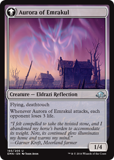
K: I’d characterize a lot of the flavor text in this set as workmanlike, which isn’t necessarily a bad thing. There’s a lot more story telling going on on the cards these days, and there’s a whole lot of story to cram into 2 sets. As a result much of our card space is used very effectively to tell us how the plane is reacting to the Eldrazi invasion, what our main characters are up to, and how this whole thing gets resolved. The one problem is that all this exposition doesn’t leave much room for more evocative flavor text. The biggest exception, to my mind, is Aurora of Emrakul, which captures the Lovecraftian vibe of dread and anticipation better than anything else in the set.
T: Truly haunting. Remember, folks: When you find a strange, eerily glowing stone object in the middle of the road, don’t unload your only form of transportation and take it home. Just walk away, and contact your local highway department.
The Ancient Grudge Commemorative Worst Flavor Text Award
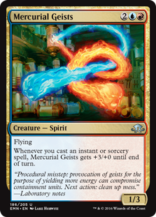
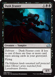
K: Also a consequence of using the flavor text for story purposes: Not as many outright duds! If flavor text were graded on a curve this set would be earning high marks. Sadly that means that Ancient Grudge continues to be our high watermark of bad flavor text. The worst offenders are not even that bad, but we’ve still got some classic mistakes on display here. Dusk Feaster is a great example of proper noun overload. Hey guys, I’m a giant nerd and I still don’t know what at least one of those things is. The real Grudgie winner, Mercurial Geists employs one of my least favorite tropes. You know, when they attempt to convince us that characters are smart by making them talk (and, even worse, write lab notes!) in this insanely stilted way. Scientists don’t talk like this. Nobody talks like this.
T: Science-y flavor text has been done well on some of the Izzet cards from the Ravnica blocks, but this is not one of them. This flavor text was written by someone who thinks academic literature sounds like the log book from Metroid Prime. Mercurial isn’t the same word I’d use to describe a pair of flaming ghost skulls, but they will look pretty rad next to the Noose Constrictor tattoo once it’s finished. Dusk Feaster does require some background knowledge about the plane of Innistrad to fully understand, but that’s why you have accredited flavologists like ourselves. You see, Lurenbraum Fortress is where Olivia’s army marches from. I’m trying not to use too much technical language here. I hope that helps clear things up!
Best Name
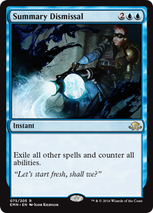
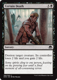
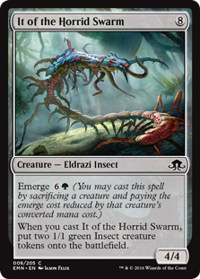
K: Short phrases are the new single-word names, as proven by standouts like Certain Death. Many of the Eldrazi have super cool names as well, but my favorite is It of the Horrid Swarm. By the way, Summary Dismissal, I see that you’re trying to reboot Geist Busters, and I just want to say this set is ruining my childhood.
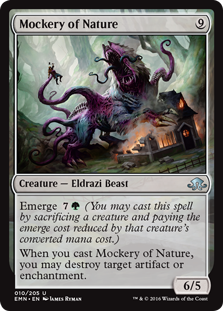
T: Mercurial Geists are no Slimer, that’s for sure! The best names in the set obviously belong to the Eldrazified creatures like It of the Horrid Swarm and Mockery of Nature, but there’s no shortage of strong competition. Certain Death deserves a shout-out not only for its evocative name, but also for its unflinching depiction of that one time when No-Face snuck up on OJ Simpson while he was out in the forest chopping wood. Remember, folks: If there’s something strange when you’re chopping wood, who you gonna call? That’s right, your local department of wildlife.
Worst Name
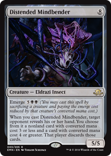
K: Hey gross. The rhyming is not working for me, the mental image is not working for me, the word ‘distended’ on anything at all is not working for me, and all those things together don’t add up particularly well.
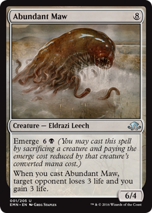
T: As much as Distended Mindbender sounds like the subject of a dirty limerick from the Natterknolls, I don’t think any other card has a name as jaw-droppingly stupid as Abundant Maw. As far as I can tell, whoever named this card noticed that the creature has a big mouth (which, I should mention, is neither unique nor superlative among the creatures in this set) and just looked up two synonyms for ‘big’ and ‘mouth’ more-or-less randomly in a thesaurus. The fact that this card made it to print calls into question whether anyone at Wizards of the Coast even knows what the word abundant means in the first place. This leech sucks, abundant time.
Achievements in Design
Best Recontextualized Reprint
K: Art and flavor text doing good work to make reprints feel interesting rather than boring. They’ve gotten a lot better lately at showing how the same spell manifests on different planes, which is cool to see and just adds flavor in a previously underused space. I’m excited to see them reaching the logical conclusion of this trend with those cool new Kaladesh Inventions they just unveiled.
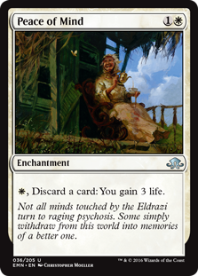
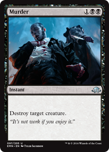
T: Murder happens everywhere on Innistrad, but Peace of Mind is harder to come by. The flavor text does a great job of tying things together. Even when your porch is dilapidated and your teacups are full of holes, there’s respite in the simple beauty of nature. You can look at your hand and see it as half-empty, or you can see it as half-full of Healing Salves.
Best Callback to Innistrad
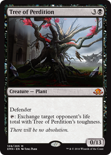
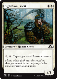
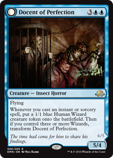
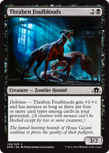
K: That’s Sigarda’s Scythe, the symbol of her church. If there’s anything scarecrows hate, it’s a scythe. Because they’re made of straw. It’s the symbol of her… Anyway, there are other fun callbacks besides Sigardian Priest/Avacynian Priest. Watching the story of Delver of Secrets continue to evolve (Sorry, ‘transform’) has been a lot of fun in the last few sets, and now the cycle is complete with him making now own miniature Delvers as Perfected Form. There’s also a few cards that demonstrate that things have somehow gotten even worse for our favorite horror plane, like Thraben Purebloods falling victim to zombification. Did Innistrad really need additional downers like this? Probably not, but it worked for me. My personal favorite is Tree of Perdition, replacing Tree of Redemption in a perfect dark mirror.
T: This block has given us not just one, but two Delver sequels, and I feel like they were really scraping the bottom of the barrel for names when they came up with Docent of Perfection. Luckily, a giant insect that spawns wizards is cool enough that they could’ve called it Bumbledore and I wouldn’t have cared. Commons like Thraben Foulbloods really help flesh out the world, but Tree of Perdition has to be the best callback of the set. When the whomping willow has corpses hanging from its boughs, it’s time to get rolling, no jk.
Best Top-Down Design of a Horror Trope
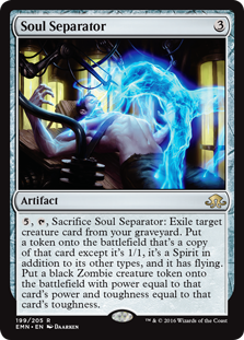
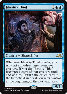
K: It’s hard to come up with cards this wordy that still feel worth it. These manage to hit with a combination of flavor text, name, art, and intuitively understood trope, even if they read more like Ice Cauldron (which also would’ve been right at home on Innistrad). Soul Separator gets so close to clunky, but for my money doesn’t cross the line, and boy does it aim for the fences. Identity Thief may get minor points off for being a variation of the Evil Twin trope, but the fact that he traps you in a mirror specifically really makes it work for me. Overall this set has proven that they are not completely out of fuel for horror-based cards, and that’s very good news.
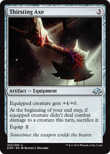
T: Soul Separator is a towering achievement in flavor. It takes zombification, which has been done to death, and breathes new life into it. When the payoff is there, I’ll read as much rules text as they want to print. Congratulations to Ludevic for inventing it, and our condolences to his poor dead child, whose lifeless corpse still wanders this earth. Thirsting Axe also deserves an honorable mention, even if only to alert the public to its existence. The last thing we need is someone else picking up that damned axe by mistake again.
Best Overall Design
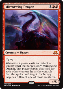
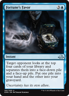
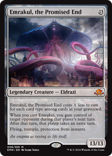
K: Emrakul, the Promised End fittingly stands tentacles and shoulders over all the designs in this set. It works in the themes of delirium and manipulation, fixes the super unfun problem that mindslaver had, and even appropriately dies to Dark Salvation or Imprisoned in the Moon. Great art, fun card, A+. I also feel like the gameplay experience of Fortune’s Favor is so great that it warrants mention here. This is a card that you might run not because it’s good, but because the ensuing sub-game is so much fun. Also, Mirrorwing Dragon deserves some credit. Guys, you did it, congratulations, you finally made an interesting dragon. I’m so proud of you!
T: It’s highly theoretical that Dark Salvation could kill Emrakul. You’d need 15 mana and a way to give all your zombies flying. Maybe you could even use Mirrorwing Dragon to do it. I’m not saying it can’t be done, you’d just really need Fortune’s Favor to make it to 15 mana with a flying-zombie-based combo deck. I’d ask Liliana how she managed to do it, but she threatened to kill me earlier if I didn’t stop asking rhetorical questions. Until I get a chance to look up the word rhetorical, I’m just going to play it safe.
Worst Overall Design
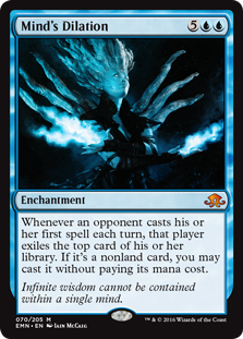
K: Who in development hated Mind’s Dilation so much that they felt like it needed to only work on the first spell cast each turn? What was the complaint, ‘too fun’? This thing costs 7 mana, requires your opponent to take action to do anything, and on top of all that you can’t even get their lands. There’s not a format it’s going to be breaking. Is ‘balanced for EDH’ a thing we’re really doing now? Still Mind’s Dilation is not the worst, in fact, with a few tweaks it could’ve been pretty cool. Heck, I’ll probably still play it. Mournwillow, on the other hand, has prompted a universal reaction of bafflement. The text doesn’t really match up at all with what either of its colors do in this game, let alone this set. It feels like a card that was dipped in glue and rolled across a pile of magic-related words. Or a mono-red card that accidentally got two different, incorrect mana symbols. At least we get the super sweet creature type of plant skeleton as a salve for the mental anguish of trying to figure out what this thing is going for.
T: The final guest to shamble across our stage this evening is Mournwillow. I’ve heard of stick figures before, but this is ristickulous! I know it might look like a lifeless mass of tangled roots, but don’t blink or you’ll miss it. This giant inexplicable tumbleweed of humanoid skulls rolls across Innistrad like some perverse doppelganger of Sonic the Hedgehog, striking despair into the hearts of all creatures with power 2 or less as long as you have four or more cards types in your graveyard. Mournwillow has two heads, one arm, and makes no sense. Although I don’t understand it at all, I still respect it, because we all mourn in different ways.
Overall Impressions
T: Eldritch Moon and all of Shadows Block really lived up to the hype of the original set. Let the record show that the flavor text of the double-faced cards and the names of certain spells have been categorically better than ever before at any point in the game’s history. The game’s art and trope-based designs have been maintaining their high standards, but I’m really bored and disappointed with the Gatewatch characters. Just don’t tell Liliana I said that! Thanks for reading. We’ll see you in Kaladesh, where we’ll find out once and for all just how much more culturally sensitive the creative team is now than they were during the design of Arabian Nights!
You can find Two Jesses on Twitter @TwoJesses.

