When most people think of Cube drafting, there seems to be a predilection to think of it as an all-star Limited game (showcasing the strongest and most expensive cards throughout Magic‘s 18-year tenure) or an extension of Pauper Magic (more or less the opposite), but I would like to make a light case for Cube drafting as I see it: an exercise in set-building.
Luckily, I don’t have to go it alone here; Zac Hill recently wrote an awesome article on (basically) this subject for the mothership! Here are a few highlights from Hill’s piece:
“In fact, it’s really easy to come up with 229 neat, appealing spells–almost too easy, in fact. Most of the work of late design/early development is getting rid of the goodie-bag feel a lot of files have.”
“[M]ost Limited formats improve when they’re given direction–when nearly every card can be slotted into some kind of strategy. These strategies can be linear or open-ended, narrow or robust, but our goal is to ensure that as many pieces of real-estate as possible pull some weight.”
“When . . . designing a Limited environment, it’s important that every color combination has at least one dedicated strategy it can pursue–it’s not just trying to announce spells and hope those spells do something. Once those strategies are determined, it’s important to render them actionable by seeding and empowering the cards and interactions that make them feasible. Then, the cards that compose those decks must be curved in such a way that it’s actually possible to play them together in a functioning deck.”
Ted Knutson seems to agree, writing, “Much like the way Constructed is being able to design your own deck to play against other people, cubing is the ability to actually design your own Limited formats,” in a blog post analyzing the recent Magic Online Cube announcement.
Designing a Cube that offers enjoyable drafting and interesting games is an immense undertaking. Wizards has an office of well-paid dorks consuming mass quantities of energy drinks, Mexican-made Cokes, and lattes year-round to bring us experiences such as Ravnica Block and Innistrad draft formats. I certainly have neither the pedigree nor the beverage preference (unsweetened, black tea for me!) as Wizards, but I have tried to take cues from Wizards’ Limited design over the years when engaging in my own Cube experiments.
Enough rambling: Let’s take a look at the cube I’ve assembled and see how things have come together!
Shadowmoor-Worship Cube
I hadn’t thought about making a cube in quite a while until James Mink (Deathcloud9) engaged me in a discussion about making use of his massive but ill-used collection for (gasp!) casual Magic fun. James had been sorting through his collection to make a cube after we drafted with Travis Chance and some Indy locals over the summer. (Somehow A.J. dodged this event, probably citing bowel troubles. [I don't recall this, but it's certainly an excuse befitting me. -- PlanetWalls]) It was nice to see old friends and play games, but the experience wasn’t quite as fun as any of us would have liked. The majority of decks were so powerful that it didn’t feel like we were playing Limited at all (especially when an extremely powerful deck was matched against one of the less-powerful creations). The card interactions just weren’t there, beyond ‘void target card’ or ‘my guy interacts with your life total.’ By the end of our talk, we knew that we wanted mini-combos and semi-archetypes to replace the pure power approach that many cubes take.
To head toward the type of interactions we so desired, there first needed to be guidelines. Since cubes don’t have the luxury of rarity distributions and print runs, at least not without a lot of work (which lazy me isn’t willing to put in!), we set our cube size at 480 cards. A normal 8-player draft takes 360 cards, so our size allows for some variety even when a full eight people can be convinced to sacrifice their evening to casual gaming. Within the block of 480 cards, there had to be more themes and rules to abide by, many which would emerge only after the previous had been decided. But one had to be set from the beginning: We would stay away from dramatic, stand-out cards whenever possible. Gesturing back to Hill’s Limited design article, a good card does not make a good card for this cube.
After the size and the decision to stay away from so-called (Constructed) all-stars, we needed to breakdown the numbers of mono-color, hybrid, multicolored, and colorless cards. Since Shadowmoor (and to a lesser extent, SHM-SHM-EVE) draft was one of my favorite formats, I lobbied to use a lot of hybrid cards and cards that get better with a bunch of a particular type of basic land to incentivize single-colored draft decks. To limit splashing without regrets or concessions, we didn’t add any dual lands (traditional or otherwise). The final color breakdown came to 70 hybrid cards, 20 gold cards, 10 land cards, 40 artifact cards, 70 green cards, 70 red cards, 70 white cards, 65 black cards and 65 blue cards. Black and blue were shaved slightly since those colors tend to have a wealth of control cards, and we didn’t want to overload on them (although whether or not that logic was effective is another story).
Once we were settled on Shadowmoor‘s mass hybrid-gold and mono-color-matters cards, we decided that one of its other themes would be obvious: -1/-1 counters! Plenty of hybrid cards from the block have persist and wither. Infect also creates -1/-1 counters, but since it has the downside of making Magic less than fun, we only added a few cards with the keyword to keep the win condition infrequent. When all was said and done, the current version of the cube was left containing 41 cards that involved -1/-1 counters.
With -1/-1 counters, an immediately obvious thematic pairing is +1/+1 counters. (For those of you unaware, +1/+1 counters remove -1/-1 counters and vice versa.) Luckily, undying just came around in Dark Ascension to show persist how it’s done. We also have spikes from Tempest Block (sorry, Rath Cycle!) and graft creatures from the Simic Guild (courtesy of Ravnica block). A few more additions from Magic‘s past, and the total number of cards creating +1/+1 counters was 55!
We added a few cards with proliferate (to make the counters go crazy) and a few cards that dealt with counters other than the power/toughness-enhancing variety (including three planeswalkers). Three cards manipulate counters on permanents in a non-proliferating way (Medicine Runner, Gilder Bairn, and Vampire Hexmage), three cards do the same for creatures (Leech Bonder, Oubliette, and Kulrath Knight). Of course, there are also plenty of blink-effects (like Flickerwisp) and bounce-effects (like Vapor Snag) to reset the number of counters on a creature to its native quantity. Hell, there are probably even counter interactions going on in this mess of cards that I haven’t yet thought about!
After hybrid-mana cards, we reinforced the incentive to draft a mono-colored deck by adding a healthy dose of cards that get better, the more of a specific type of basic land a player controls. These come in three varieties: (1) cards that scale based on the actual number of basic lands controlled, (2) cards that require a hefty amount of one color of mana, and (3) cards with activated abilities that require specific, colored mana and are cumulative. The first type of card is exemplified by cards like Jaws of Stone or Harbor Serpent; they might be okay with a few of their respective land type, but they get out of hand as the number climbs! The second type of card only gets better in the sense that it is easier to cast on curve if you have a lot of the appropriate basic land type. The last card type is similar to the first, but usually the effect is just modification to power or toughness of a creature you control (although there are cases like Flowstone Overseer). Twenty-three cards fall into the first category; I haven’t run the numbers for the other two, but my eye does get drawn continuously to Phyrexian Obliterator!
Up to this point, we had just been jamming cards into piles based on a few criteria, but we knew that we needed to build some actual archetypes into the colors to make them worth playing. In most Limited formats, each color has a basic strategy of which most Magic veterans are aware; this cube should be no different. But in this straight-forward, color-oriented approach, an additional layer of complexity was available. Both Rise of the Eldrazi and Ravnica used auras (I would call them enchant creatures, but I’m just old like that) to accomplish roles normally occupied by sorceries; why not take the best from both and other blocks? This gave us another layer of interaction without much cost in the way of card slots used. It also gave white a little more identity (as a lot of the creatures that are aura-lords, for the lack of a better term, are white). The current incarnation of the cube has 48 auras and 19 non-enchantment cards that interact with them (and aren’t your basic Disenchant-style effects).
Also, we wanted to build some remote notion of the color pie into the colors via iconic or at least familiar spells, so precedence was given to cards that did what a color does best. Black got a heavy helping of removal (spot and awkward mass), some discard, some graveyard recursion, and, of course, cards that exact a toll (on your life total) to use. Blue has more spells than guys, some countermagic (and other cards that result in spells not resolving as the caster intended), card draw, fliers, thievery, and assorted tempo-based spells. White gets its typical mix of weenies and utility with a smattering of removal, creature augmentation, and some high-end finishers sprinkled in. Green and red have gone tribal with goblins and elves to supplement the usual burn (red), ramp, and combat tricks (green).
Lastly, there is a mini-defender theme present (but for what reason I am not really sure, beyond my love for blocking and all things life conserving, of course).
White, Blue, Black, Red and Green
Hybrid, Multicolored, Land and Artifact
|
| ||||||
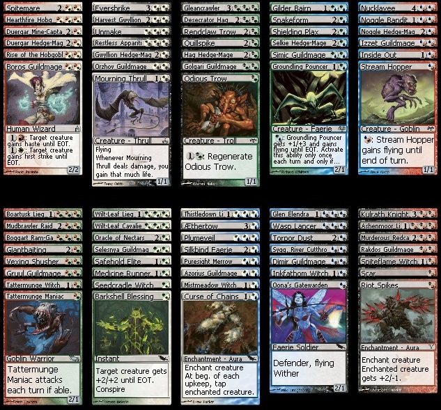
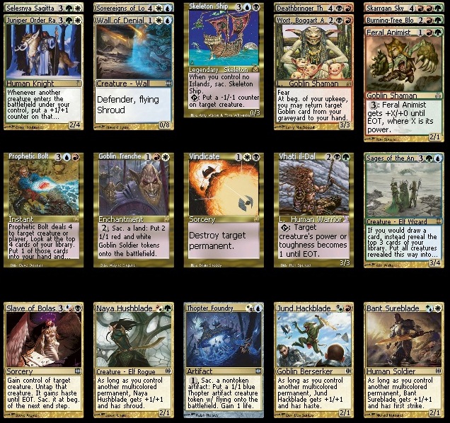
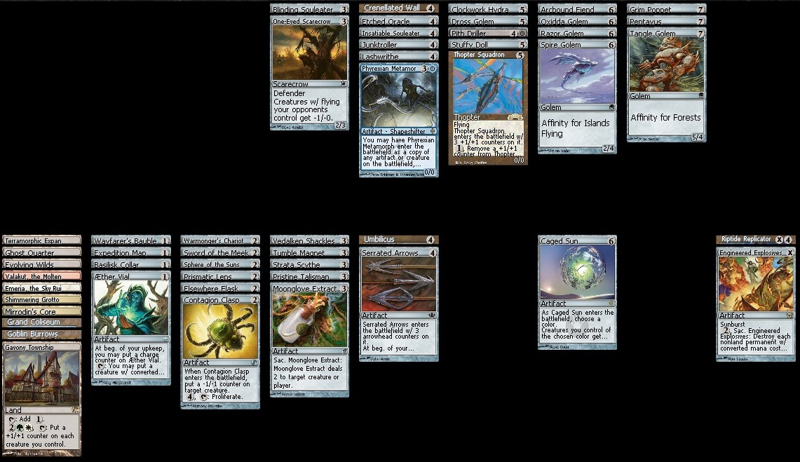
Phew, that was a lot of work! But the beauty of cube design (compared to set design by R&D) is that the process is indefinite; this cube will continue to evolve (and has already changed a bit since I started writing: Vindicate out, Death Grasp in) as cards prove obnoxious or underwhelming (or new sets come out). I have already found what I believe to be a few other flaws (too much removal, some lame creatures, weaker-than-desired enchantment theme, improper placement of color-activated cards such as Gavony Township, etc., in the slot allocated to colorless cards, dearth of hybrid-mana cards), and expect them to be worked out in the coming months.
I expect to have a large update before this article goes live; the cube is being assembled for Grand Prix Nashville, and I hope to get a lot of feedback on it. (I’m bringing a large assortment of cards to edit the cube on the fly and to fill in spots with cards that I had forgotten to buy!)
There are plenty of articles and blogs on the subject of building cubes (with which I may or may not agree). Should you want to read more on the topic, you can do so at
- The infrequently updated cubedrafting.com
- SCG articles and the IdRatherBeCubing blog via Twitter’s @UsmantheRad (and others)
- Limited Resources Cube page
Using Magic Online to Build a Cube
I basically don’t own any paper cards these days (although that is about to change as the cube in this article is further edited and assembled), so I didn’t have the luxury of setting rows of cards (sorted via color and converted mana cost) in front of me and physically manipulating them to build a cube, but fortunately I did have Magic Online (and a billion man hours of experience using it). Despite the innumerable problems with the program, it is quite handy for building something as unwieldy as a cube!
Here are a few rules to establish to make the process manageable:
1) Do not log in to Magic Online when you plan on making big changes or analyzing your cube. If you lose your Internet connection, the program will crash (and you will lose your work).
2) Make a separate file (deck) for each color (and gold/land/colorless if they’re around in any sizeable amount).
3) Deselect the “MY CARDS” box at the top of the deck editor. It is best to work with this initially even if you have a big collection; you never know what gems are hiding in the un-owned category!
4) Never click the “SHOW ALL VERSIONS” or “MY CARDS” boxes or the RESET button while you are physically manipulating the cards. Also, do not “SAVE AS” while you’re sorting (the file should be previously saved, so that further saving can be done with the “SAVE” button). Any of these actions will default-sort your cards through Magic Online‘s presets.
Beautiful sort before:

Awful mess after:
5) Do not use foils if you wish to draft and play with the cube on Magic Online. The wishlist feature, discussed in the next section, and using TappedOut.net to Draft a Cube (and Magic Online to play with it), does not work well with foils. (It’s sad for the Pimp My Cube enthusiasts out there, I know.)
6) Use a spare account to tweak and hold the cube for drafting. A lot of people probably don’t have the 5 or 6 extra accounts that I’ve managed to accumulate over the years (back when a new account was just spending 10 dollars on items from the Magic Online Store), but obtaining one for the purpose of maintaining a cube is worth the cost (even with the new pricing structure). Do not open the Planeswalker Pack that comes with your account (as it will add additional clutter). This account can be used to hold the cube, modify it, and easily assess anything missing at the end of a draft — well worth the money!
The main advantage of using Magic Online to build a cube is having a database of cards that is easily searched and manipulated. Sure, using Gatherer is a bit more powerful, but actually taking the data and putting it to work on a massive scale actually requires more work (though Gatherer is probably better for fine tuning after the first draft of the cube has been built.)
Using the “SELECT ALL” option from the right-click, drop-down menu, we can add all cards from a query or move all cards from one window of the deck editor to the next. (Please note that Magic Online might lag if hundreds of cards are moved at once.)
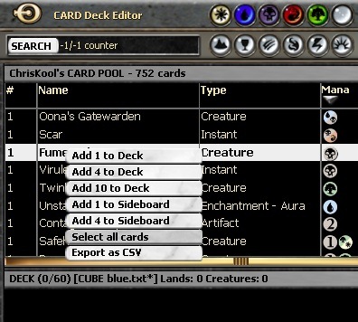
But moving cards lumps them in one huge pile:
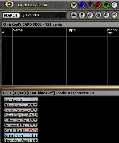
You’ll have to sort them via filters or manually after the move:
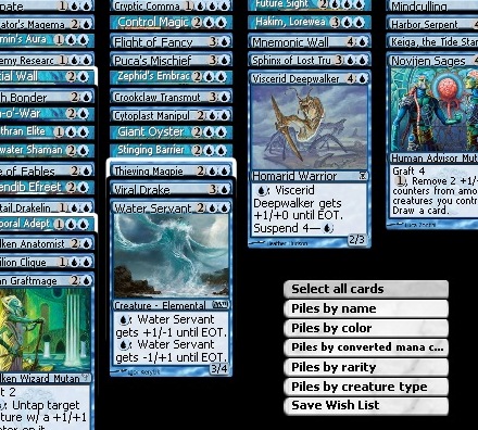
Here is the “Select all cards” drop-down menu in the deck window:
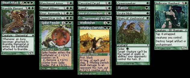
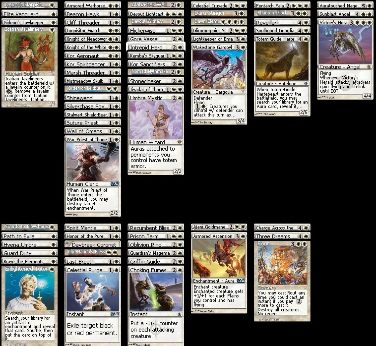
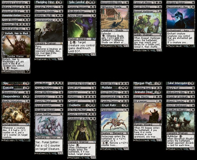
Manually sorting cards by their intended functions in the cube is vital to seeing holes in any color’s cardpool. By using the image view of the deck editor, it is easy to arrange cards in different, functional piles. Entire colors can be examined functionally this way. Here is an example of a sort of the color black by card function. I’ve arrayed the cards according to (right to left columns, top row): creatures that just attack, creatures that attack with evasion, utility creatures, defensive creatures, card advantage/tutoring, creature augmentation. And (right to left columns, bottom row): very situational removal, situational removal, mostly solid removal, mass removal, graveyard recursion, discard. It looks like black might be a bit removal heavy…
To finish this little foray into Cube, we will look at one (labor-intensive) way to Cube draft and play on Magic Online!
Using TappedOut.net to Draft Your Cube
Thanks to the functionality of TappedOut.net, this cube is available for mock drafting and sample packs! The Limited Resources Cube page has a great walkthrough on using TappedOut.net to draft (and then play on Magic Online) as part of the Cube rules and stuff page. It takes a lot of patience, and you need to trust those with whom you’re cubing (or be prepared to deal with player dishonesty), but it’s pretty fun when you finally get to play!

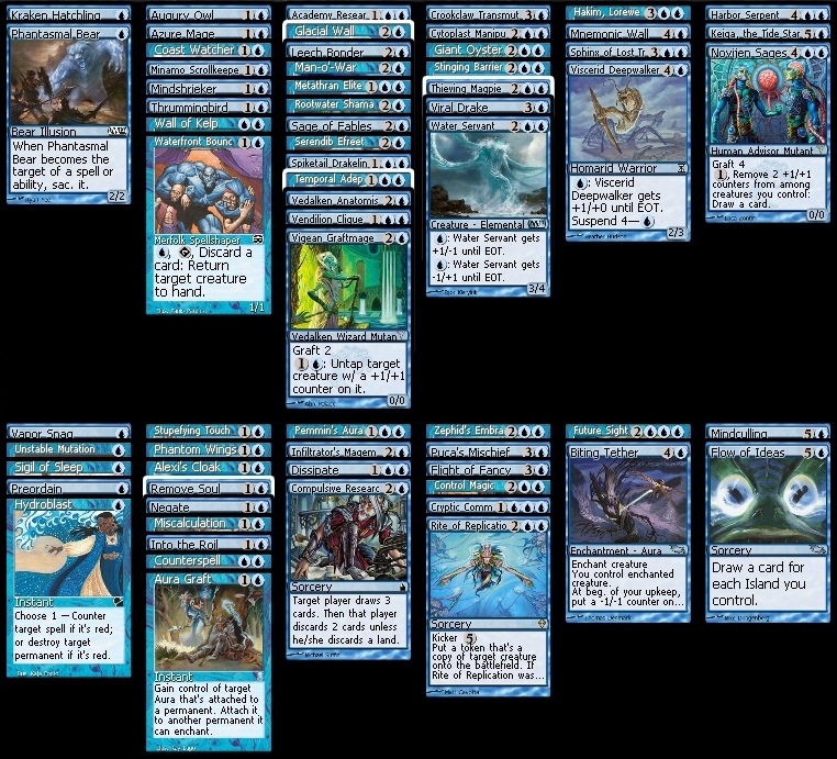
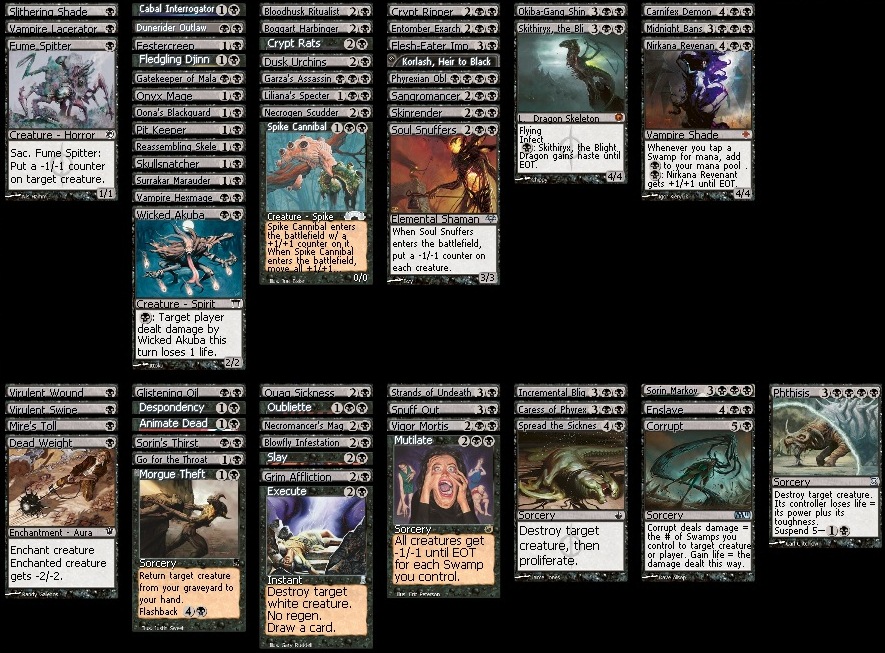
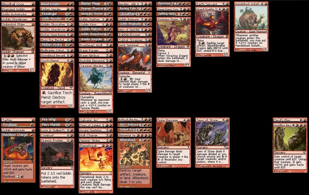
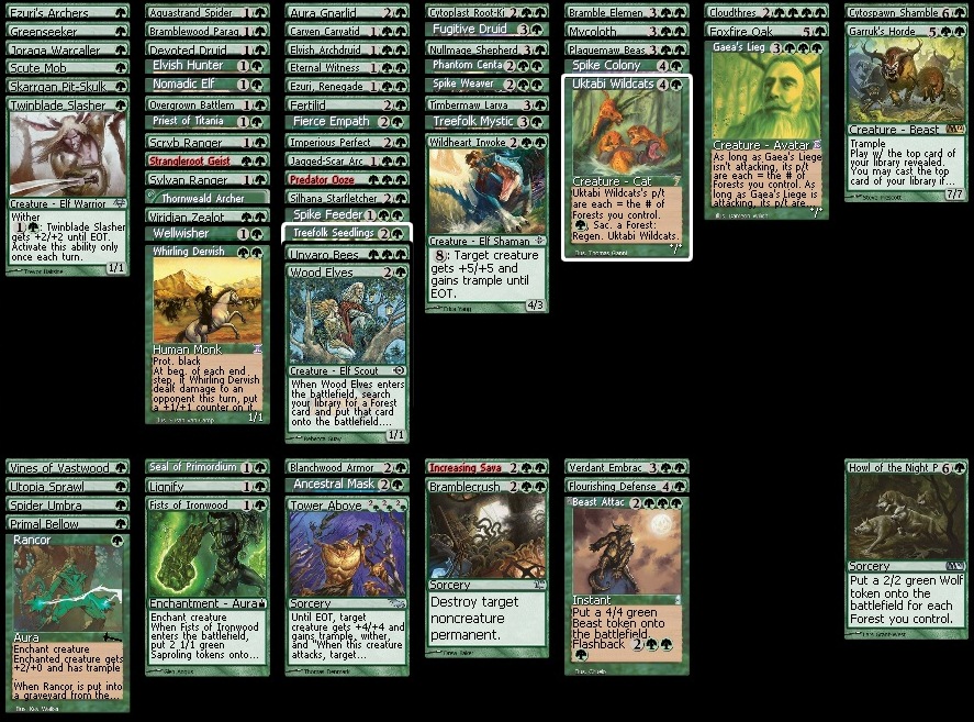

After drafting this a few times, I want to (1) add more hybrid, (2) balance the colors with cards like Valakut, the Molten Pinnacle and Gavony Township in their proper places, (3) reduce some of the black removal, (4) add more cards to deal with utility creatures and (5) reduce some chaff for role-fillers and spells.
We did two 4-mans, the first was “mono” black (splashing a few red cards) losing to black-green midrange (mostly to mana issues in games 2 and 3). The second two man featured mono blue with a strong enchantment and proliferate theme beating elves splashing white and black-white control.
Looks cool.
No video?
TLDNR
^^Video any time soon?^^
Scrolled through and didn’t see the video.
Cubing via MTGO takes a lot of organization. I will get up videos for it eventually!
Newest incarnation: http://tappedout.net/mtg-cube-drafts/mtgoacademy-shadowmoor-cube-v2/
Yo yo! I played Kool’s cube whilst in his blonde company, alongside Aj and Mr. Minker planet drinker. We got into a horrible argument about the (im)balance of a few colors, but, on the whole, it was pretty fun.
I will say that the inclusion of cards because they are “funny” is a waste to me. I would rather not have them at all, as they just make the good cards in the pool better by comparison. Red, surprisingly, is by far the deepest and most ferocious color in this particular cube; the goblin synergy is damn-near constructed–as though the guts of a red deck wins was just shuffled into the mix. I would def dilute/bring up the comparative power levels of each color so it isn’t so lopsided.
Other than that, the whole aura thing didn’t really work the way I was hoping. I think I would relegate those mostly to their respective colors (G/W), with a smattering in each other.
The counter/proliferate is a blast in this cube. Most fun part for sure.
Good job, Kool!