Jesse K: Routinely referred to as “the best card in the game”, basic Island lets you cast Time Walks and Ancestral Recalls in Vintage, dodges Wastelands and Chalices of the Void in Legacy, and in Modern is just about the cheapest mana base you can find while still being competitive. And you can even play more than 4 of them in a deck. Broken! Today we’re going to walk you through some of the best basic Islands. Everyone knows that unmatched lands are for filthy casual players. If you’re looking to take either your competitive deck building or your flavor expertise to the next level, considering sleeving up a whole atoll of one of these.
Jesse T: This is gonna be easy! Shuffle up a dozen full art lands and call it a day!
K: Oh, and no, we won’t be doing any full art lands, because that would be an unfair advantage. Everyone knows those are sweet, but what we’re trying to do is give you the scoop on some Islands that aren’t really mainstream yet. Consider this your door into Island hipsterdom.
T: We’ll also, of course, be evaluating each Island based on its strategic value and keying you in on some interesting facts about its inhabitants. Each Island has its own unique history, culture, and interpretation of what constitutes good graphic design. Let’s set sail on a trip across the seas of the Multiverse, and yet somehow still be able to attack our opponents who live in the Mountains anyway!
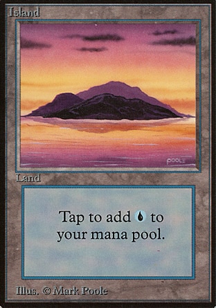
T: Any list of Magic‘s classic lands wouldn’t be complete without Mark Poole’s Beta Island. The Island of choice for several pro players, and synonymous with Vintage in every sense of the word, it is one of Dominaria’s oldest and most expensive Islands. In my opinion, the only people with any business running Beta basics are people who were playing in 1994. This game is already expensive enough without turning basic lands into a status symbol. Merfolk of the Pearl Trident are probably rolling over in their graves right now!
K: Great choice and a great place to start. No list of Islands would be complete without the original, and in this case it actually looks quite nice. This island makes use of a color palette that is actually still not seen very frequently, and remains the only island to be depicted at sunset. Don’t check that claim, I just made it up now, but I think it’s true. The perfect island if you’re a nostalgic type and are just picking up the game after a long absence to play casually.
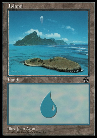
K: Balloon Island is probably my favorite Island. It comes originally from the historical oddity that is Portal 2. Not as well known as Portal 1, not as desired as Portal 3, what Portal 2 did have was anachronisms to spare. Wish they would visit a plane with modern technology one of these days? They already did it. Well, at least kind of. In addition to goblins with shotguns, buzz saws, and submarines, Portal 2 also has hot air balloons. I think the thing I like about this Island is the combination of how peaceful it looks, and how the balloon adds relatability. The ideal Island to have in play while you’re losing really badly, as thoughts of floating away in that balloon will really cheer you up.
T: This Island doesn’t have many places to hide, but it seems like a good location for a lighthouse or small farm. The Islands of Caliman are inhabited by the Talas pirates, so play these in your Pauper decks when you don’t want your opponents to expect Ninja of the Deep Hours.
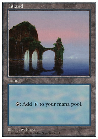
T: This Island from 5th Edition marks the first time they ever printed new artwork on basic lands in a core set. It has some pretty nice places for swimming, and those arches are beautiful, but it’s annoying to climb back up the vines afterward. Consider installing an elevator or stairs.
K: This Island has a lot of character! Seems like it might hide secrets, like it’s the Island from Myst or something. The shape of the arches is very appealing, plus we’ve got that nice reflection going on there as well. It’s odd that such a placid sea would produce erosion of this nature. Play this Island in your morph deck, because there’s more than meets the eye going on here.
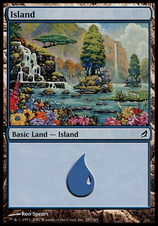
K: This Island is almost too much. Almost. It kind of reminds me of a Kinkade, which would usually not be a compliment. However, Magic has so little lightness in it that I feel like the exaggerated tranquility of this (and the other Lorwyn lands) was a really welcome break. It’s nice to sometimes tell a story in which the whole fate of the world is not at stake. A great Island for decks that are chiller than average, like Battle of Wits or Polymorph.
T: This land smells great! Don’t play this one if you’re allergic to pollen. Also, be careful of the insects, not because they bite, but because if you swat one you could accidentally murder a fairy. Trust me, that picnic will take a dark turn.
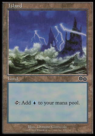
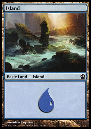
T: The stormy seas of Dominaria provide the perfect natural defense against troublesome interlopers. In the rocky cliffs of Tolaria, you can truly go about your heretical machinations in peace! These primo lairs were much more affordable back before Urza built the Academy and the place got gentrified by college students.
K: A moody Island that would look good as a blacklight poster. This is the Island that says “shut up, I’m not like YOU dad” to the original Island. It lets your opponent know that you’re a deep and conflicted individual, so it’s a good choice of Island for your blue-black deck.
K: This Island is another one from a block that subverted the traditional “things get worse and worse” Magic story structure. In Avacyn Restored everything actually got better! Well, everything except the gameplay of the Limited format. Still, I like the concept, and the way they showed the change using the basic lands was very interesting. Innistrad had a similar ship Island, but it was being tossed by dark, stormy waters. The mood here is still very gothic, but the beams of light add to the color palette. Another Island that I find compelling because of the presence of a vehicle, by the way. I guess seeing signs of life in the land helps you imagine being there. Choose this Island if you own a boat, or like spending time on the ocean.
T: Innistrad used to be like Times Square in the 80s. You could buy two corpses in Nephalia for the price of a wooden stake. It was incredible! Ever since Avacyn cleaned up the place you can’t even hang out near a freshly-dug funeral plot without getting profiled and strip-searched by a Goldnight Redeemer. What am I supposed to do with all these giant Tesla coils and no corpses to reanimate? Does Avacyn have any idea how expensive these things were?
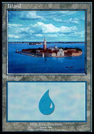
T: If you like signs of life, how about an Island with a whole city on it? This is from the European lands program, and I believe it’s modeled after an actual place in Denmark. I’d love to visit there one day, but it was destroyed years ago by a Stone Rain.
K: I almost feel like these special Islands don’t count because they’re promotional items, not from an actual set. However, if you can get past that arbitrary guideline I’ve set, you won’t find a nicer one than this. This is a gorgeous landscape and really makes you wish you were touring Europe instead of sitting in a nerd basement and playing Magic. No European Magic pro should be without a set of lands depicting his home country.
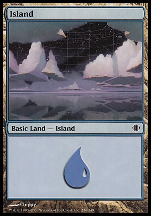
K: This Island is exceptional because it does such a good job of representing the plane it’s from. This island shows the “shard” of Esper from Shards of Alara Block. This was the plane that introduced the colored artifact, as well as everybody’s favorite crazed artificer/planeswalker Tezzeret. Okay, maybe he’s the 2nd or 3rd favorite crazed artificer/planeswalker. Either way, the extreme artificiality and manufactured nature of the world comes through really nicely here, with the grid lines in the sky and the perfectly flattened clouds. It’s also a very creative interpretation of the concept of an Island, which I think is a good thing. I firmly believe that not every Island needs to depict an actual island, but it’s certainly a topic up for debate. I would recommend this Island if you have a science-fiction themed deck or want to play with those Star Wars Magic cards that Reddit has been talking about lately.
T: Esper’s Islands are technically perfect, according to the optimal Island specifications of the Ethersworn hegemony. I’m not 100% convinced that these aren’t actual islands, sitting in a perfectly-still ocean, with clouds of the exact same size and shape floating overhead. Or maybe the clouds are, like, really just reflections of the islands? Who knows? Everything is an illusion! Just don’t fall into those giant gaps in reality and die.
T: This rarely-seen Island lay off the shores of Balshan Bay during the oft-forgotten period of Dominaria’s history in which it was ruled by an undersea kingdom of octopus people. It’s idyllic shores make me long for a simpler time, when people lived off the land, knew their neighbors, and served as witless thralls to tentacled overlords. Free will is a curse, and I’m sorry I ever doubted you!
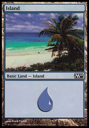
K: I like that this Island depicts a natural beach with its native plant-life intact. You rarely see that these days unless you really seek it out. That’s prime real estate after all. This is another promotional item, given out to players participating in the long-running Arena Leagues, which encouraged semi-casual, semi-competitive play from 1996 to 2006. They’ll run you a pretty penny now, at around 9 dollars apiece, but not as expensive as some Islands, and not as expensive as undeveloped shoreline property. Use this Island if you have aspirations of making it big some day and getting a house by the shore.
K: For me the palm tree is indelibly connected with my mental image of an Island. There’s actually a surprisingly low number of basic Islands that feature them, which is odd to me. This is the nicest of them, and has a cool bonus of showing the island from a different perspective (on the Island, looking out, rather than looking in on the Island from outside). I find the image here very relaxing. This is probably the top Island I’d like to visit, maybe hanging out at a tiki bar just off to the side. Choose this Island if you intend to play Magic on the beach, or if you’re into surfing.
T: [to the tune of “Kokomo” by The Beach Boys]
Zerapa, Suq’ata,
Girl, you know you gotta
See Mwonvuli, Uktabi,
Mispronounce them prob’ly.
Just like Zhalfir, Teremko,
Baby, why don’t we go
Down to Jamuraa?
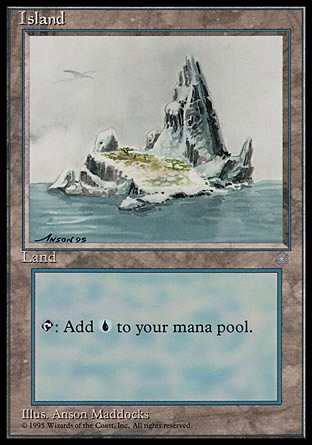
T: Islands from Ice Age were the first basic lands ever printed with art that was different from the core set. This one even featured a vague scribble flying overhead for added character. The history of Terisiare is a cyclical story of the rise and fall of highly advanced civilizations — a stern warning against the arrogance of pushing our technology too far, which the developers of MTGO have apparently really taken to heart.
K: A good Island, definitely. Good attention to atmospheric conditions helps keep this Island immersive. I almost feel cold looking at it. One good use for this Island is if you want to trick your opponent into thinking you’re playing a deck that cares about snow-covered lands, because this Island is definitely covered in snow. In fact, when you look at the Ice Age Islands, they’re pretty much all covered in snow, which makes the designation of the special supertype somewhat confusing.
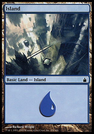
K: Definitely saving one of the best for last here. This is as close as you can get to a basic Island living up to the description “iconic” without resorting to the original lands. Ravnica was a really unique plane the first time around, and took an all new approach to the basic lands. This is the first time that the original concept of them needing to look like plains or swamps or islands was abandoned wholesale, and the lands were allowed to just evoke their color of mana. This image of the city from above tells you a lot about the setting and tone of the set it hails from, and still communicates today what people found compelling about the popular plane. Use this Island if you’re a small plane pilot or an urbanite.
T: We all know Ravnica is the best plane, but does it have the best basic lands? To be honest, it always bothered me that all of the shock lands were artificial edifices rather than natural land formations, but the new “frat boy” lands from Zendikar (too basic to be of any use) have finally fixed that. All things considered, this Island is pretty spectacular. Can you imagine getting chased by your enemies through that mazelike network of bridges and fastnesses? They wouldn’t stand a chance! It’d be like trying to hunt down M.C. Escher.
Corner of Shame
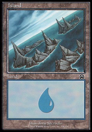
K: You’re not fooling anyone with the dutch angles; this Island is a stinker. They look barren and uninviting. The jagged atoll concept is cool, but it’s been done much better than this, most memorably all the way back in Urza’s Saga. Isn’t Mercadian Masques the block that has the giant upside down mountain with a city on top of it? They couldn’t bring anything more memorable to the table than this? I guess you could choose this island if you had a deck that was themed around disorienting your opponent.
T: The merfolk in Mercadia live inside of a dormant volcano, and if these were the only other islands around, I’d be willing to take the same risk. It’s actually a really interesting city, and you can see it in the background of Cloud Sprite, of all cards. They also worship a giant robotic dragon, just in case things ever start to make too much sense.
T: Did you ever lose your last pencil and have to fill out a legal document in crayon? I feel like a similar thing happened with this artwork. I honestly think that I could draw a better Island than this in MS Paint, and if I can do it, then it’s not art. In fact, I think I’m going to spend the rest of my life learning to paint really really well, and then nothing will be art anymore. That’ll show ‘em!
K: It feels like there’s something odd going on with perspective here, too. At the angle we’re seeing this landscape from is not right. There’s also a question of scale raised for me here. I would almost be willing to chalk it up to a stylist decision, like Ku Xueming wanted to do a landscape that evoked an older art style, but if that was the case, maybe it doesn’t go far enough? I’m going to blame whatever style guide Portal Three Kingdoms had for being inherently confusing.
K: This Island looks like a giant gross radioactive maggot, and that is the most generous thing it could be compared to. I don’t know why you’d ever put this in your deck, but consider it if you’re an entomologist.
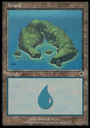
T: I can’t tell if this Island is covered in trees, or if it’s just made of green rock. I wonder if this is one of the Islands where Urza did his weird eugenics experiments and created the Metathran. Does the name “Bloodline Project” sound problematic to anyone else?
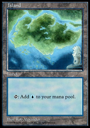
T: Most of the real-world locations on the promotional lands look pretty cool, but this is the one exception. Instead of showing off the natural beauty of maritime Southeast Asia, this art is literally just a poorly-drawn map of Singapore. There’s even a little crest with a merlion in the corner, which — in a game about magical monsters — can really only be seen as a missed opportunity to include an actual merlion instead.
K: I like that the merlion is kinda facing toward the Island, as if he’s saying “well, here’s that island I was telling you about”. I commend the artist’s attempt to do something different stylistically, but when you’re given the direction to draw “an Asian/Pacific Island”, I have to think drawing a map is just a lack of creativity.
K: Look, we all know why this Island is here, let’s not sink even further by going into more detail. I’m a big fan of choosing a sincerely good island, but if you are really into trolling, I could see a mana base of just this Island (obviously all foil) being really appealing. Maybe put it in your high powered mono-blue EDH deck. Play a Sol Ring on Turn 1 off of this Island, or cast a Mana Drain on someone’s general using two of these.
T: I don’t want to make any obvious jokes, but it’s really hard, kind of like this Island. Thankfully this article looks like it’s about to come to a climax, sort of like this Island. Just kidding, I’m having a ball, unlike this Island.
K: The hedrons just pop off the page as if to say “I HEARD YOU LIKE HEDRONS”. The basic lands in Rise of the Eldrazi were just massively disappointing, as you had to deal with your packs no longer containing a much-desired full-art basic. They were also all very samey, as if the artists didn’t have any leeway to draw something (anything) other than erupting hedrons.
T: And we’ve finally come full-circle to Zendikar. Do a bunch of hedrons kind of floating near water really count as an Island? Apparently so. If you like hedrons, be sure to check out part 2 of our Battle for Zendikar flavor review, when we give out awards for the best and worst hedrons of the set. Hedrons! We guarantee more gratuitous <> hedrons <> than any other flavor review on the Internet. Until then, keep holding up double blue!





Best review article of all time
I currently have 8 foil copies of Island #2 (you know which one it is). My goal is to get enough to play Fish in Modern.
Hilarious article: ‘The hedrons just pop off the page as if to say “I HEARD YOU LIKE HEDRONS”.’ Lol
Really disappointed you didn’t have the sunset island from mirage. http://gatherer.wizards.com/Handlers/Image.ashx?multiverseid=3584&type=card
I too have often considered Venice, Italy to be an actual place in Denmark. (It says it’s Venice on the card you big sillies!) I’m glad you guys shouted out the Ron Spears Island from Lorwyn, as it (and his Swamp from the same set) inspired my full playset of Lorwyn/Shadowmoor lands for limited.