Make sure you check out our last article for more info on what we think of Magic Origins flavor as a whole. We’ll still be here when you get back.
Awards for Special Achievements in Art
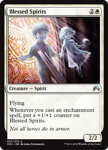
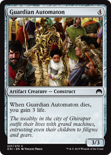
Creepiest Use of Children
Jesse T: Some of them die in fashionable kids’ polo shirts.
Jesse K: Thanks, Wizards, for making sure anyone playing your game feels like a monster. There’s no other way to look at this card — we’re officially summoning child soldiers to fight for us at this point.
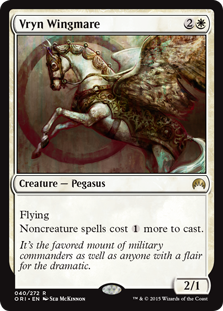
Card Art Most Likely to Be Mistaken for a Political Campaign Portrait
K: Fun fact: the Vrynian Government tried to assassinate Vryn Wingmare 638 times between 1960 and 1965.
T: Vryn wingmares are prized as the only wingmares known to naturally adorn themselves with expensive jewelry, thus eliminating the tedious process of doing it yourself.
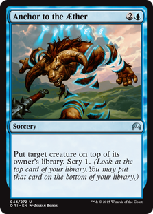
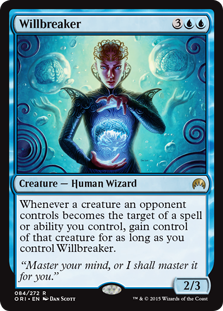
Best Representation of Being Returned to the Top of the Library
T: This is like, the most obvious greenscreen I’ve ever seen.
K: Hey, at least it’s not another take on ‘washed away by a wave’
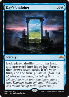
Best Remake
T: I feel like I finally understand what the Timetwister effect is supposed to represent.
K: Kudos on coming with a really evocative name and illustration for such a complex effect. One of my favorite pieces in the set overall. Although I do have to wonder how Dolmen Gate switched roles so completely.
Most Unexciting Art
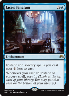
K: Wow, finally I get to see where Jace kinda just… hangs out. Fewer posters than I expected, but there is a giant-sized Hot Topic glass pyramid.
T: …and over here, we have Jace’s kitchen. As you would expect, there is an island.
K: Clearly a remnant of a cut cycle. Hopefully this isn’t the last opportunity they’ll have to print Gideon’s Mancave or Nissa’s Patio, because those are cards I’d much rather play with.
Most Direct Visual Metaphor
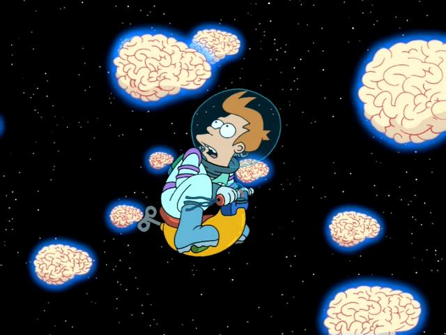
T: Do they have an extra brain strapped to the back of their neck?
K: Hey, you can never have too many brains.
Least Menacing Demon
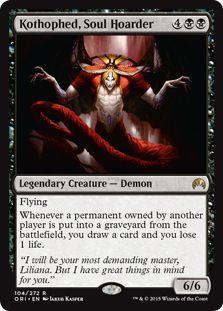
K: This is what they went with for Liliana’s big bad, huh? I guess it’s perfectly in line with the amount of disrespect that character is regularly shown already. Jesse T, what’s your favorite aspect of Kothophed’s design? Is it his spindly grandma arms? His lumpy, textured red tail? His bangs? Or perhaps you’re more of a giant scarab beetle on his head kinda guy?
T: I was sort of mesmerized by what appears to be a belt made out of giant purple crystals. Speaking of which, that top = barf.
Worst Reprinted Art
T: What is that background? The opening theme from The X-Files?
K: Ah yes, good ol’ “look what I learned to do in photoshop”. To me it’s nearly inconceivable that this art got the okay to be printed in the first place, so you can imagine how baffled I am at this is a choice of reprint. I’m practically clutching my head in confusion.
Most Unusual Pose
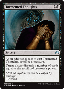
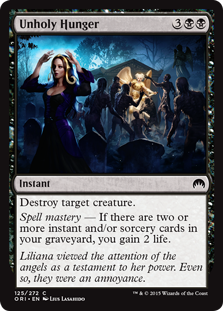
T: I’ve had it up to here with these meddling angels!
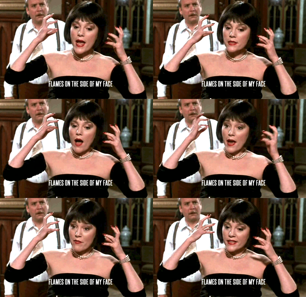
K: I’ve heard it said that it looks like Liliana is going “oooh, look at me, I’m an angel, look at my fancy halo,” and that’s a good interpretation, but all I can see is…
Hunkiest Hunk
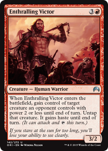
T: If you stare at his abs for too long, you’ll look like that goblin on the right.
K: I imagine the flavor justification for this card’s ability is that he convinces you to go to try out a crossfit class with him.
Special Award for Most Overused Visual Cue
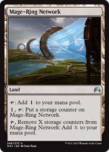
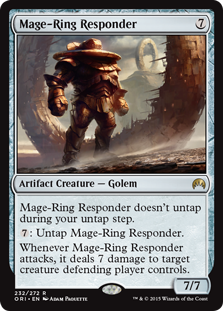
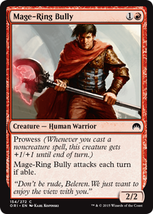
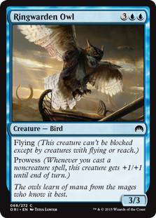
K: These rings are so loud, I just picked up my telephone.
T: Oh my Lord of the Rings… Now we know where Beyonce’s going when her planeswalker spark awakens.
K: It has now occurred to me that even that stupid Wingmare has a ring on it!
Most Improved Artwork
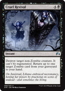
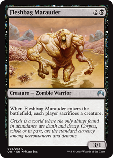
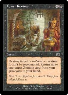
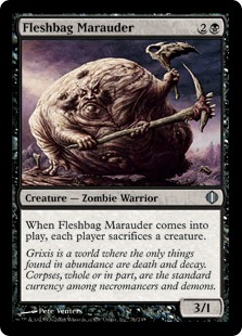
T: This award goes to the color black, which now has not just one, but several cards that are tolerable to look at.
K: Oh come on, who didn’t love the old versions of these cards?
K: Ok… I see what you mean about Cruel Revival, that is just a strict upgrade. Ol’ baggy on the other hand is kinda hilariously gross. I guess they had to change art because now that Donald Trump is running for president he didn’t want his former career as a Magic card model to get in the way.
T: Also, Wizards could be sued for libel for saying he trades in corpses. Those charges were never substantiated.
Special Award for Use of Perspective in Art
T: Blood? What that demon needs is some lotion.
K: I appreciate that this card follows the number one rule of budget horror movies— if your monster doesn’t look good, try not to show it. And if there’s anything we’ve learned from this set, it’s that demons can look really stupid.
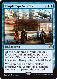
Special Award for Outstanding Achievement in Worldbuilding
K: I think Ghirapur and Kaladesh in general just look great. This card in particular manages to convey the relatively rarely seen utopian sci-fi world really well. You get a sense of not only the hustle and bustle of the city, but of its high level of integration of technology into the daily lives of its citizens. This is where I’m hoping our next block takes place.
T: This one card does more worldbuilding than every Mage-Ring in the set combined.
Most Confusing Art
T: Here lies Ghost Rider, having tragically crashed his motorcycle in this haunted swamp.
K: Picked up this art on the cheap at the Scary Stories to Tell in the Dark unused illustrations clearance sale.
Best Non-land Art
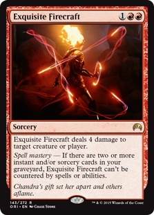
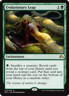
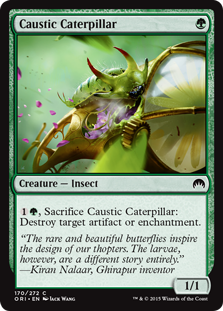
K: I had a hard time with choosing the best art this time, so I just went with a bunch that I really liked. I want to single out the use of lighting and shadow on both Exquisite Firecraft and Evolutionary Leap. They also both have a great color palate and create a mood effectively. Exquisite Firecraft, in particular, is the coolest Chandra has ever looked, and for a brief moment with this art, they’ve convinced me to be interested in her character. However, that’s not what I’m giving highest honors to — that goes to the humble Caustic Caterpillar. Look at that guy, just munchin’ away on his little steampunk leaf. Love the color, the movement, and the high level of detail that went into this piece.
T: I mean, yeah, these people can all draw way better than me.
The Hunt the Weak Commemorative Award for Worst Art (aka “The Huntie”)
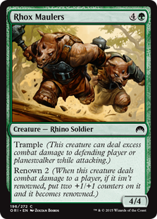
T: Although they don’t quite hold up in a Magic set, Rhox Maulers would be sweet if they were enemies in a new Donkey Kong Country game.
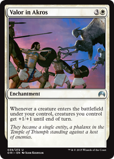
K: I feel like this job just keeps getting harder and harder. Setting aside reprints, there’s very little art in this set that looks bad. Rhox Maulers has the unfortunate distinction of being the worst of a good group, and I don’t actually hate it for what it is. It’s just very hard to make a humanoid Rhino charging the camera look good. Other cards I considered include Psychic Rebuttal (for gratuitous Jace-face) and Valor in Akros (for general glossy, untextured looking style).
T: For real. If Rhok Maulers would be at home in DKC, Valor in Akros belongs in Chess Wars.
Awards for Special Achievements in Flavor Text
Worst Misuse of Numbers
T: Griffins: Built Ford Tough
K: Charging Griffin channeling the text of one of those ”Big Dog” shirts here.
T: If you just took the eagle half of that griffin, you’d have a pretty sweet decal.
Honorable Mention
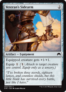
K: Listen, I’m not an expert, but it sounds like you might be using lances wrong.
T: The trick to keeping your sidearm in good condition is to never use it because it’s horrible.
Sneakiest SAT English Prep Material
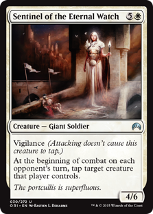
T: I repeat, the portcullis is superfluous. This is not a drill.
K: I disagree, I find the portcullis indubitably cromulent.
Sickest Burn
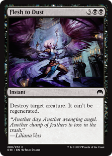
T: Part of Liliana’s backstory is that she apparently “seduced Jace, having a torrid affair with him,” but “her fear of her demons got the better of her affections for Jace,” and she was punished with “constant bleeding and enduring pain.” So, basically Jace’s sole purpose as a character is to cater to the vengeful misogynist demographic of Magic players who secretly believe that women’s periods are supernatural retribution for rejecting them.
K: Sigh… as much as they’ve dumped garbage on this character, I can’t say I totally hate Liliana. Maybe it’s our shared animosity towards angels. Throw those things in the trash, along with Jace’s hurt nice-guy feelings.
Most Unusual Place to Insert Economic Commentary
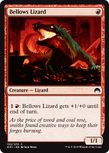
T: Tell me about it. If this student loan debt gets any worse, I’m gonna need a lizard myself!
K: “It’s a living!” –Bellows Lizard
Most Pseudo-Inspiring Flavor Text
T: 90% of being a planeswalker is just believing in yourself.
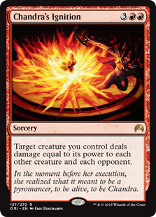
K: What this flavor text doesn’t cover is that the end result of this epiphany is Chandra deciding that she just really loves setting things on fire.
Most Unnecessary Explanation of Card Mechanics
K: Wow, I’m glad they told me why this card makes two goblin tokens instead of one, three, or any other arbitrary number. Certainly it’s not enough that the art shows two goblins, since before I read the flavor text I was like “What on earth are these two goblins even doing here?!” Now if only someone could explain the full backstory behind Promise of Bunrei to me, we’d be all set.
T: They’re gonna have to errata the flavor text on Hordeling Outburst now. Why do goblins always travel in threes?…
Quippiest Quip
K: Will we see an Anchorman quote on a Magic card in our lifetime? This is probably the closest we’ve gotten, and it bodes well for things to come. Stay classy, Dominaria.
T: Chandra clearly has something in both of her hands, and she is in the middle of a fight, which is no time to be making smart remarks.
Most Distracting Use of Rhyme
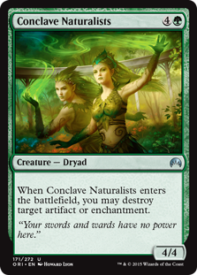
T: The conclave doesn’t need another Swords-n-Wards. Support local businesses!
K: The flavor text in this set is mostly Words and Turds.
Most Confusing Statement About a Robot
K: Loyal to a fault??
T: Don’t you ever get tired of all those other rambunctious, hard-to-train robots?
K: God, I wish this thing I created would show a little initiative sometimes and maybe refuse to follow my commands or something. Not like anything could ever go wrong with that.
Most Confusing Statement Not About a Robot
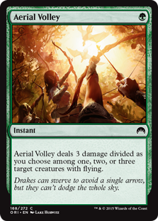
T: Shoot the sky! Bring the whole thing down! The sun is its weak spot!
K: I do wish this card depicted the non-euclidean nightmare of something behind smashed by the sky itself. The main problem I have with this flavor text is it would be so easy to fix. Drakes can swerve to avoid a single arrow, but where will they go when we can fill the whole sky. Something. Anything. This sounds like it was written by one of those Neural Networks that all of RnD will probably be replaced with in 5 years.
Most Instructional Flavor Text
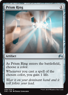
K: Do you think it drains your life instead if you’re a lefty?
T: Pros: Easy to find in the dark. Cons: Blinking light kept me awake all night.
K: Better instructional flavor text “Don’t ever put this card in your deck.”
Award of Recognition for Successful Use of Humor in Flavor Text
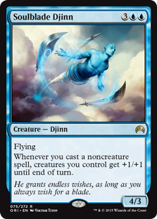
T: I hate to split hairs, but that’s not really granting wishes so much as it is attacking people constantly with knives.
K: Look, we all know that genies are dicks, always twisting your wishes around so they come back to bite you in ironic ways. Not so with Soulblade Djinn! The combination of this ridiculously specific djinn with the idea of a person who is just always wishing for a sword come together to always get a chuckle out of me.
Honorable Mention
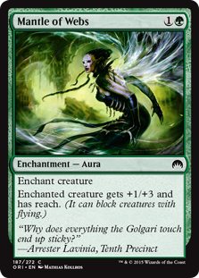
T: Arrester Lavinia, paraphrasing Will Smith’s character from Men in Black.
K: Look forward to many more of Arrester Lavinia’s quips and wisecracks in CSI:RCG, coming soon to whatever station CSI is on.
Highest Number of Proper Nouns in a Flavor Text
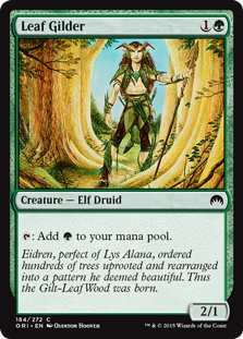
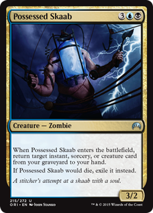
K: The two cards receiving awards here are getting them for different reasons. Leaf Gilder has this amazing first line of flavor text that I would imagine is just about impossible to get through, unless you’re already familiar with the lore of the now 8-year-old Lorwyn Block. However, it does kind of explain itself as you go on, and by the end you kind of understand what they’re getting at. Possessed Skaab on the other cannot be beat for how quickly it delivers confusion to new players. What’s a stitcher? What’s a skaab? Neither of these things is self explanatory, nor does anything about the card explain them.
T: Leaf Gilder even has confusing common nouns. Isn’t “perfect” normally an adjective? Also, “thus” is the deus ex machina of flavor text.
Most Unsettling Flavor Text
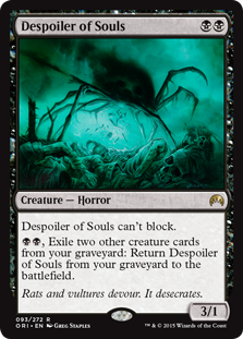
K: And on probably some of the creepiest art of the set as well! The illustration and flavor text work together to communicate that this is really a creature of nightmares.
T: What makes this flavor text so effective is that what I’m imagining is definitely way worse than whatever the author intended.
Best Overall Flavor Text
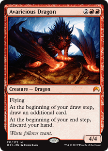
K: Strong flavor texts here, which do a good job of capturing either a character moment or the world in which this set takes place. Highest honors for me go to Avaricious Dragon, whose flavor text does a great job of highlighting the card’s mechanical and flavorful identity in a mere three words.
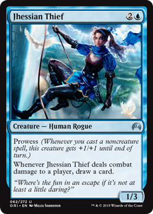
T: My favorite is Jhessian Thief, which gets special recognition for not only sounding like my name, but also at least attempting to explain what prowess represents.
The Ancient Grudge Commemorative Award for Worst Flavor Text (aka “The Grudgie”)
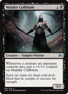
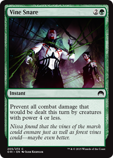
K: Vine Snare is the flavor text equivalent of someone who loves to hear themselves talk, but has nothing to say. Wow, what an exciting moment in Nissa’s character development where she learns about different types of vines. Just leave it off next time you have something this banal to contribute. Malakir Cullblade has kind of a weird run-on feel combined with an unnecessary explanation of the card’s mechanics. It’s like they had two ideas for where this flavor text could go and they decided to do both, but keep it all in the same sentence. Finally Thunderclap Wyvern. You know what, I don’t have to say anything about this one. This is the worst flavor text in the set.
T: It’s pretty hard to outdo Thunderclap Wyvern. We already know puns are the lowest form of comedy, and even calling this a pun is a stretch.
Awards for Special Achievements in Design
Most Exciting Reprint
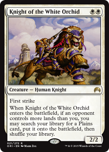
T: I think purple and gold is a little gaudy myself, but this lion-horse hybrid beast is really pulling it off.
K: I love this card — simple, powerful, and a fairly rarely used effect. White could use more of this kind of reward-you-if-you’re-behind mechanic.
Card That I Am Most Likely to Forget Exists
K: It seems like there’s a million versions now of the expensive white rare that makes some amount of tokens. It doesn’t help that the illustration is completely forgettable (I imagine myself often confusing this with any other picture of Gideon), and that it has a really unintuitive spell mastery add-on.
T: Try this mnemonic device: Graveyard open, 2/2 tokens. Graveyard full, indestructible!
Biggest Gap in Quality Between Card Name and Actual Card
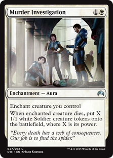
K: Unattributed CSI:RCG quote here.
T: The coroner listed the cause of death as “filled with tiny soldiers”.
K: I would love for a card called Murder Investigation to be playable, but the sad truth is that this card is too realistic. Just like in the real world, once the police officers show up, they don’t do anything to actually solve the murder and instead hang around harassing teenagers and giving out speeding tickets near the end of the month.
The Running Out of Names Award
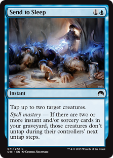
T: They opted not to use “Banish to Snoozetown” because it references an actual location on Vryn by name.
K: After hearing about Jace’s MRA fantasy backstory, I’d keep him far, far away from any kind of unconsciousness-inducing magic.
Most Fun Card Name to Say
T: Empty yard, draw a card. Cast two spells, regenerate each other creature as well!
K: Dack deftly defies Dromoka’s draconic dark dabbling. Defy, Dack, defy.
Honorable Mention
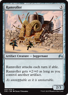
T: Unsteerable? Livestock puns really get my goat.
K: Ramroller? Ruh-roh!
T: Zoiks, Scoob! Like, holy cow!
Stupidest Card Name
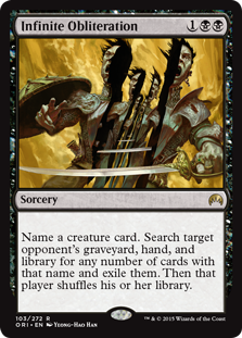
T: Sometimes double, triple, or even times-a-million obliteration just won’t do the trick.
K: I can’t wait til they print a strictly superior version of this card and call it Infinity Plus One Obliteration.
Honorable Mention
K: From a company that has a card called Nightmare already and it’s an evil horse, this is not even that egregious.
T: Well, at least a mare is a kind of horse. What’s the snare? It looks like the bondage suit from American Horror Story is hanging over the bed.
Throwback Award for Achievement in Nostalgia
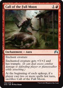
K: Remember playing Innistrad Block, you guys? Wasn’t that great? Well forget all that now, because you’ve gotta take your medicine and play the core set for a few more months. But weren’t those the days?
T: I like that they made this card completely unplayable to capture the curse-like nature of lycanthropy.
Most Tacked-On Line of Text
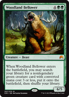
K: Flavorwise, why does this refuse to get a legendary creature? Perceived level of importance, I guess? Like Rofellos hears this guy bellowin’ for help and he’s like “Talk to my secretary?”
T: Every set now there’s some big green creature that looks like a badly-operated muppet.
K: Of the creatures in this set, this is probably the one I’d want most as a pet. The bellowing might get annoying eventually, but he looks so cuddly.
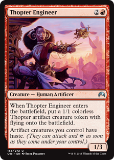
Most Compelling Theme: Thopters!
K: Have I already said I want to go to Kaladesh next? Cause I want to go to Kaladesh. Look how cool this place looks.
T: There are a lot of issues with drones nowadays, chief among them being that they don’t look like whimsical bejeweled insects.
Biggest Flavor Controversy
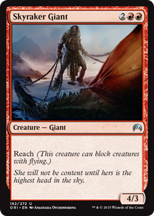
T: I’m fine with this. Personally, I think red should get some kind of regeneration or indestructibility if it’s going to get a primarily green ability. Like a Last Chance for creatures. Coming back from the brink of death at the last minute is exactly what red does!
K: I can forgive a lot of the confusion this card causes, but it’s finally answering a question I have wondered about for a long time— if some giants have reach, why don’t all giants? It turns out that the answer is just that most giants don’t care enough. I can buy that.
Plainest Planeswalker
K: So Chandra’s plus is doing damage to a player, and her minus is doing damage to a creature, and her ultimate is doing a bunch of damage? Like, by shooting fire. Wild, how do they come up with this stuff?
T: Chandra doesn’t deliver much as a character, but she never promised much. In that sense, we’re getting exactly what we bargained for. I’ll take some damage with my damage, thank you.
Worst Overall Flavor
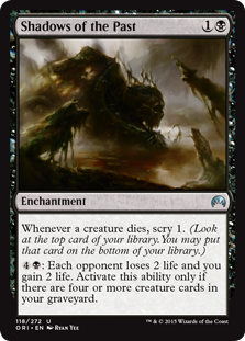
K: Normally I try not to pick on the same card twice in one article, but come on, Shadows of the Past. We already know that the art’s not giving us any hints about what’s going on here, but let’s look at the text. Two largely unrelated abilities with seemingly randomly assigned numbers all over them. 5 mana! 2 life! 4 creatures! Scry 1! The only thing that ties this together at all is that it vaguely wants to be in a deck where creatures are dying, but even then, if you’ve been doing a bunch of scrying you probably have better things to do with you mana. This card’s text feels like the set had a minimum required word count and they needed to fit it all in one card.
T: As much as I like this card, it is exceptionally unwieldy, and I’m now more confused about Palace Siege than ever.
Best Overall Flavor
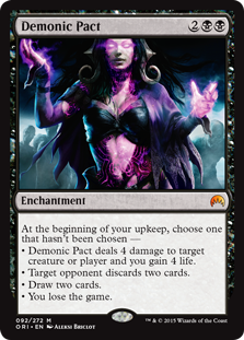
K: This card is amazing, and I think most people have complimented the strong flavor here by now. Just completely captures a popular fantasy trope and puts it right onto a Magic card, and it’s even an important story moment. When this card is in play it changes not only the way the game plays, but how it feels. When you cast demonic pact you are putting yourself in Liliana’s shoes, and you get to feel a little bit of her desperation and drive.
T: An obvious winner. I even like the flavor that you can defect to green or white for a piece of enchantment removal, just like you can accept Jesus on your death-bed in real life.
Honorable Mention
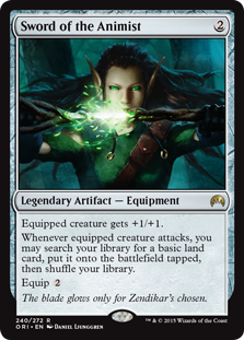
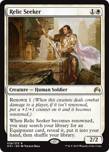
K: And this card is great too. If renown is meant to represent the creature achieving notoriety or going on an adventure, it makes perfect sense to show the spoils of that quest in the card as well. How’d this guy get renowned? He went on a quest for a holy sword! I wish more renown cards in the set had a flavor payoff like this one.
T: I’m still searching for a playable piece of equipment in this set.
Thanks for reading part 2 of our flavor review! There are lots of great cards, cool designs, and ostensibly imaginative places that we’ve visited during this trip through the multiverse, but the real winner is you, the reader, for having the free time and lack of self-control to make it all the way to the end. Like the core set, you will be missed until we write another article in a few weeks. Farewell, and ggs!















Just awesome and entertaining. Thanks for the article!
Lame liberal feminist twonks!
It’s always great to hear from fans. Please note that while we always appreciate compliments, we can’t always accept them, as “lame” could be considered ableist language. Thanks for commenting, twonks!
You know what irks me from a flavor perspective? That Gideon apparently has no idea how a phalanx is supposed to work.
@Tony_Bicycle – To be fair, Kytheon might actually not know how a Phalanx works considering his backstory.